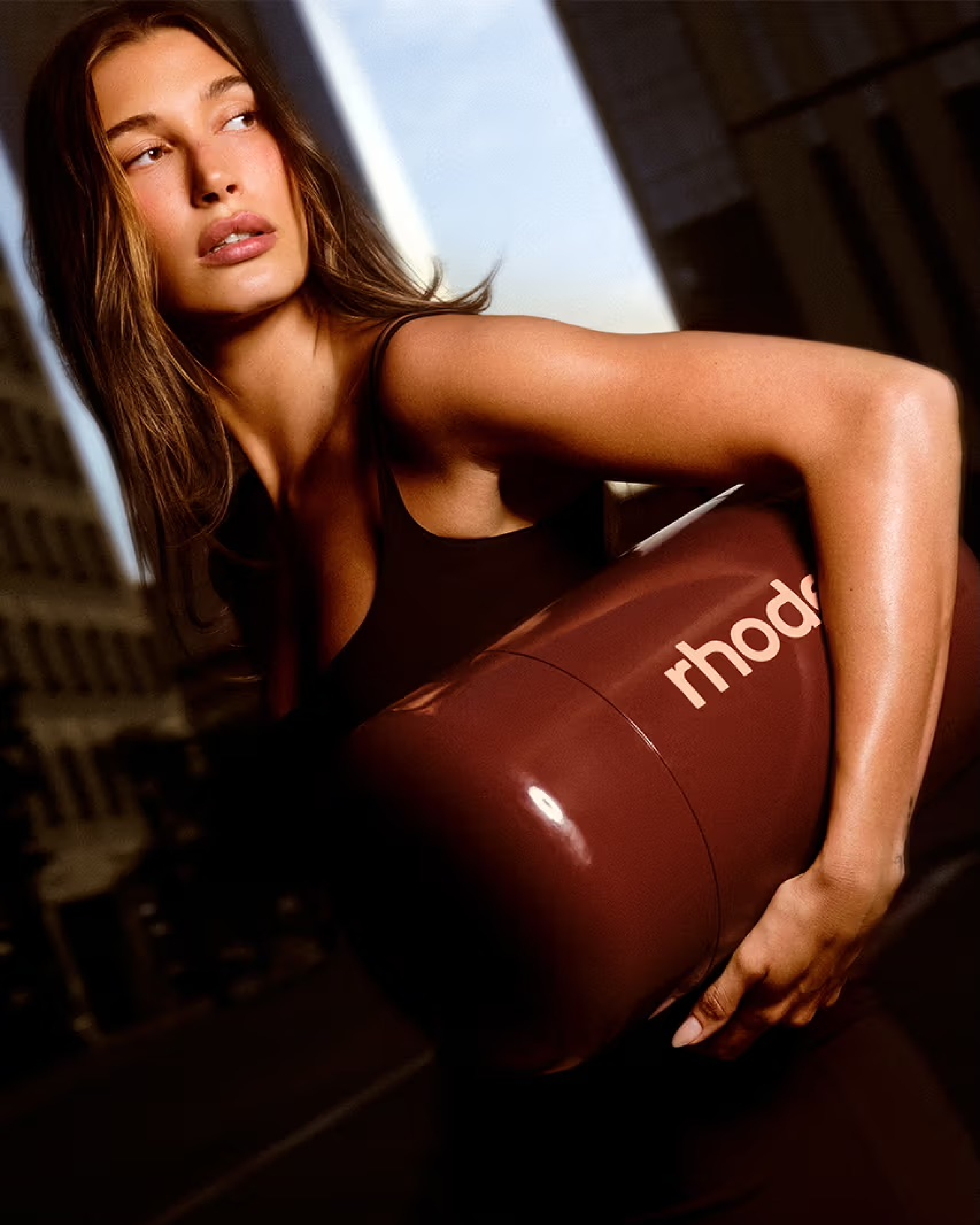
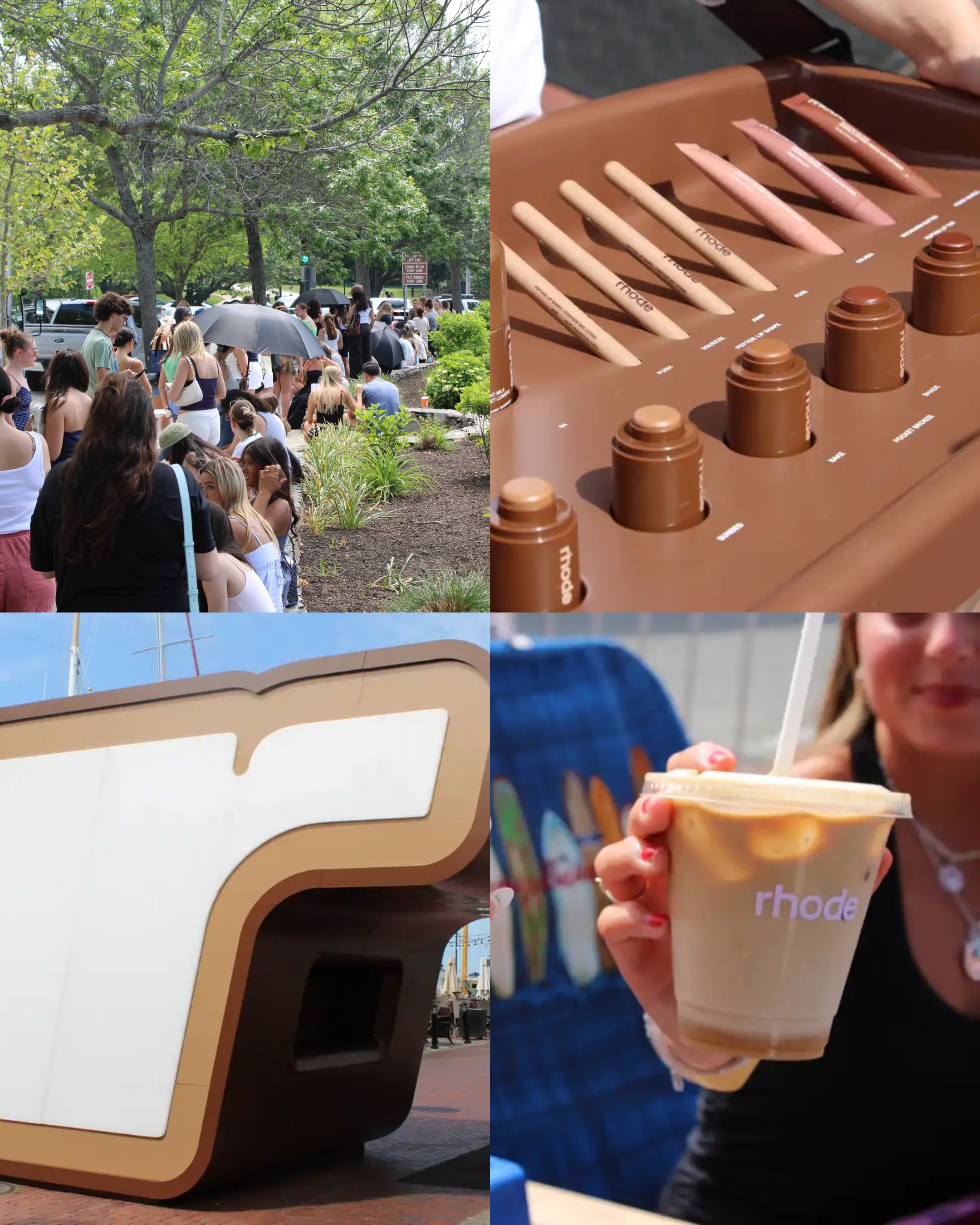
This is not minimalism for the sake of trendiness, but a purposeful design strategy that communicates the brand's commitment to simplifying skincare. It’s not just what's in the bottles that has garnered attention, but the bottles themselves, pared back to essentials, devoid of the excessive adornments that characterise many contemporary beauty brands.
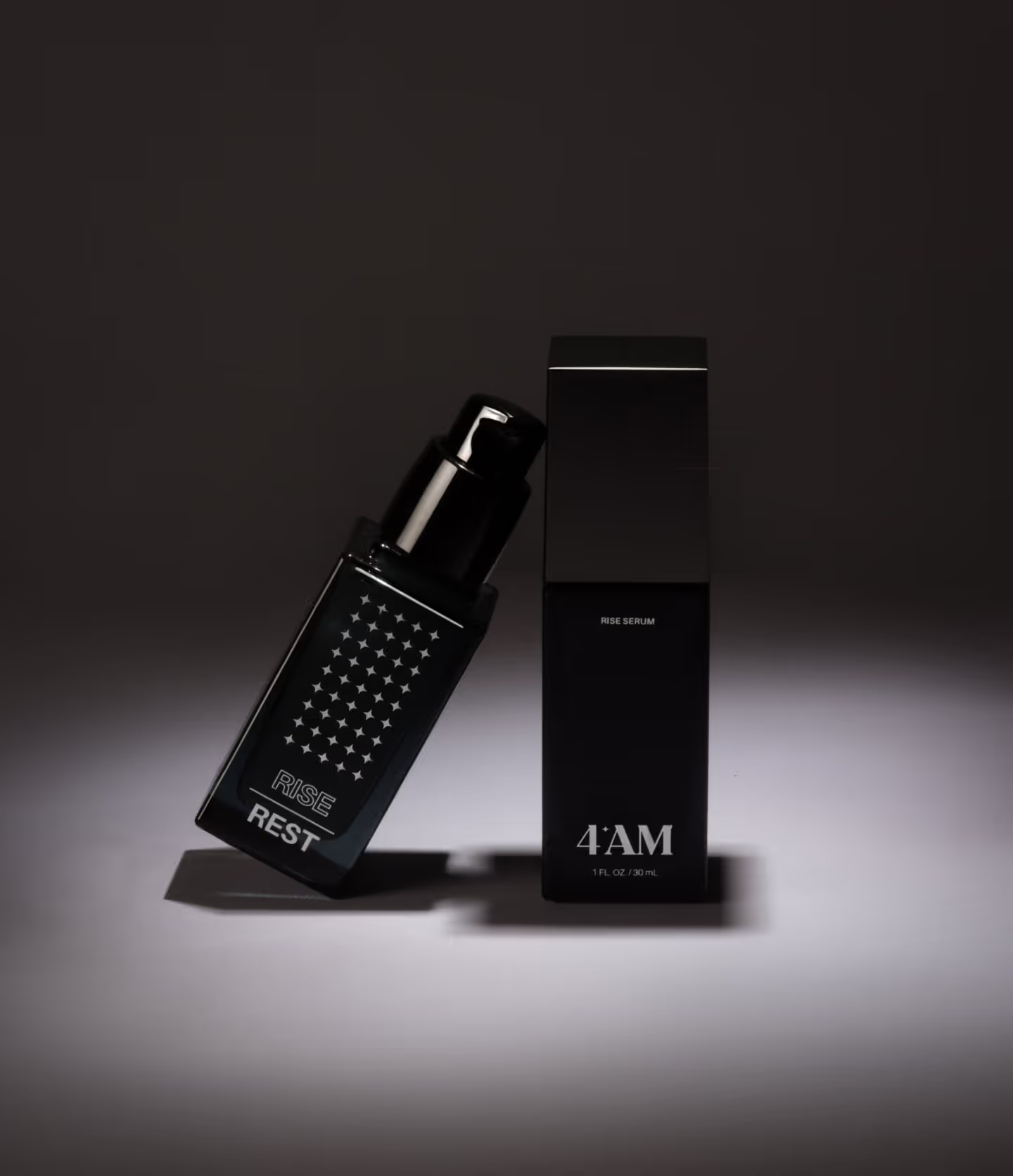
One of the first things that catch your eye about 4AM Skin is the brand's near-monochromatic palette. The muted tones evoke a sense of calm, almost like a visual palate cleanser in an industry dominated by bold colours and complex designs. The typography follows suit, favoring clean, sans-serif fonts that make the packaging effortlessly readable. This visual concordance is not accidental; it reflects the brand's intention to demystify skincare, making it approachable and understandable.
In the cluttered landscape of beauty branding, logos can easily become overly intricate, trying to communicate too much in a single glance. 4AM Skin opts for a straightforward approach. Its logo is an exercise in restraint—a simple, bold '4AM' that speaks volumes without screaming for attention. It's immediately recognisable, yet subtle enough not to overshadow the product it represents.
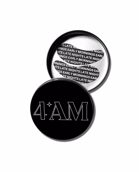
The containers themselves are not just vessels to hold a product but are conceived as part of the user experience. The minimalist design extends to the form factor of the bottles and jars, which are sleek, ergonomic, and practical. Each design element serves a purpose, whether it's the easy-to-use dispensers that control the product's flow or the opaque material that protects the formula from light degradation. Even the tactile experience of handling the packaging has been considered, resulting in a product that feels as good in the hand as it looks on the bathroom shelf.
Interestingly, the minimalist design strategy aligns with another core pillar of the brand: sustainability. In 4AM Skin's case, less truly is more. Reduced packaging means less waste, both in terms of materials and the energy used in manufacturing. It’s a dual-purpose approach that both enhances the brand's visual appeal and lessens its environmental impact.
The minimalist design of 4AM Skin isn't merely a stylistic decision; it is rooted in psychological principles. Research has shown that too much choice or too much information can lead to consumer paralysis. Simplified, clean packaging can make the selection process easier, making the brand more appealing to consumers seeking solutions, not more questions. By distilling the brand's visual elements to the bare essentials, 4AM taps into the cognitive desire for simplicity and ease, enticing a consumer to pick up their product amid a sea of over-designed alternatives.
Key Takeaways for Brand Owners
- Design as Strategy. Visual identity should not be an afterthought. It's an integral part of your brand strategy and should align with your company's goals and values.
- Consumer Psychology. Understand the psychological impact of design choices. Every colour, texture, and form elicits a response, make sure it's the one you intend.
- Differentiation. In a crowded market, the uniqueness of your visual identity can be your competitive advantage. Be bold in the design choices that align with your brand mission.
- Sustainability Matters. In a world increasingly conscious of environmental impact, a minimalist design can serve dual purposes—reducing waste while enhancing aesthetic appeal.
- Consistency is Key. Ensure that your visual identity remains consistent across all touchpoints, from product packaging to digital platforms, to create a cohesive brand experience.
4AM Skin's visual identity offers an invaluable case study in how intentional design choices can be a strategic tool for brand positioning. The psychology behind these decisions speaks to both consumer cravings for simplicity and market demands for differentiation and value-based branding. Therefore, as you develop or re-evaluate your brand's visual language, remember that every choice is a declaration of intent, a sentence in your brand's ongoing narrative, and a step towards market resonance.


.svg)


.svg)
.svg)