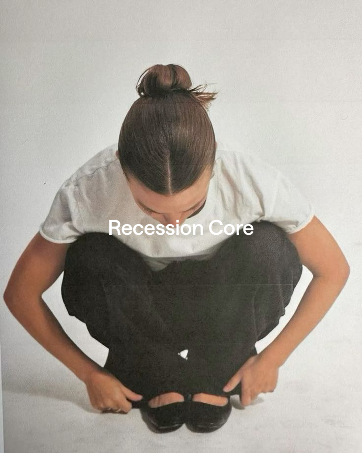
The internet’s full of aesthetics. Most of them don’t come with a business plan. In How to Brand..., we take the trends clogging your FYP and show you how to build a brand world out of them — fonts, tones, textures and all. First up: Recession Core, the anti-luxury aesthetic built on burnout, beige, and beautifully low expectations.
You’re not imagining it — everything really is feeling a little 2010 again. You’re re-downloading your Tumblr password, buying back your childhood hoodie on Depop, and quietly considering a Blackberry Curve. That strange, familiar combination of emotional fatigue, economic restraint, and soft, scrappy nostalgia? There’s a name for it: Recessioncore.
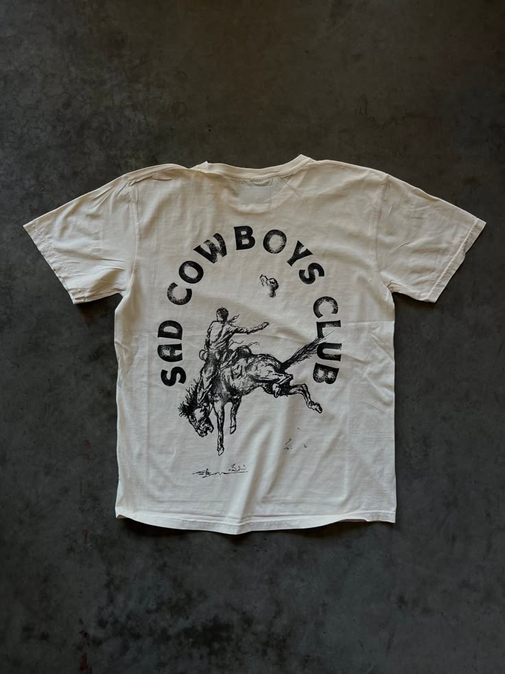
Recessioncore is the Gen Z fashion-beauty Zeitgeist for inflationary times – a consciously pared-down aesthetic born of “emotional fatigue, economic restraint, and soft nostalgia.” As one Elle analysis notes, it’s literally “dressing like you’re burnt out, financially, emotionally, existentially, but making it look chic.” It’s rooted in the idea that we’ve been here before, and we’ll be here again, so we might as well wear something that lasts. In fashion, it looks like thrifted cargos, frayed band tees, and officewear relics pulled from the back of someone else’s wardrobe. In beauty, it’s the resurgence of tinted moisturiser, drugstore gloss, and skincare routines that don’t feel aspirational — they just work.
Like most cultural shifts, it’s partly aesthetic and partly economic. Recessioncore reflects an era shaped by layoffs, inflation, burnout, and a quiet rejection of the pressure to be aspirational all the time. There’s beauty in “making do.” Style in “getting by.” Gen Z has clocked this early: as SheThePeople puts it, Recessioncore “reflects Gen Z’s shift to mindful spending – thrifted fashion, minimalist beauty, budget travel… prioritizing comfort, health, and practicality over luxury and impulse consumerism”
We’ve been here before. Post-2008 gave us normcore, Celine minimalism, Uniqlo basics. This time, the vibe is grittier, rawer, and somehow more romantic. Aesthetic references range from The Florida Project to Tumblr-era 1975 fandom. And if the last few fashion cycles were about trying harder (dopamine dressing, hyper-trends, quiet luxury), Recessioncore is about the opposite. Not not caring — just not performing it.
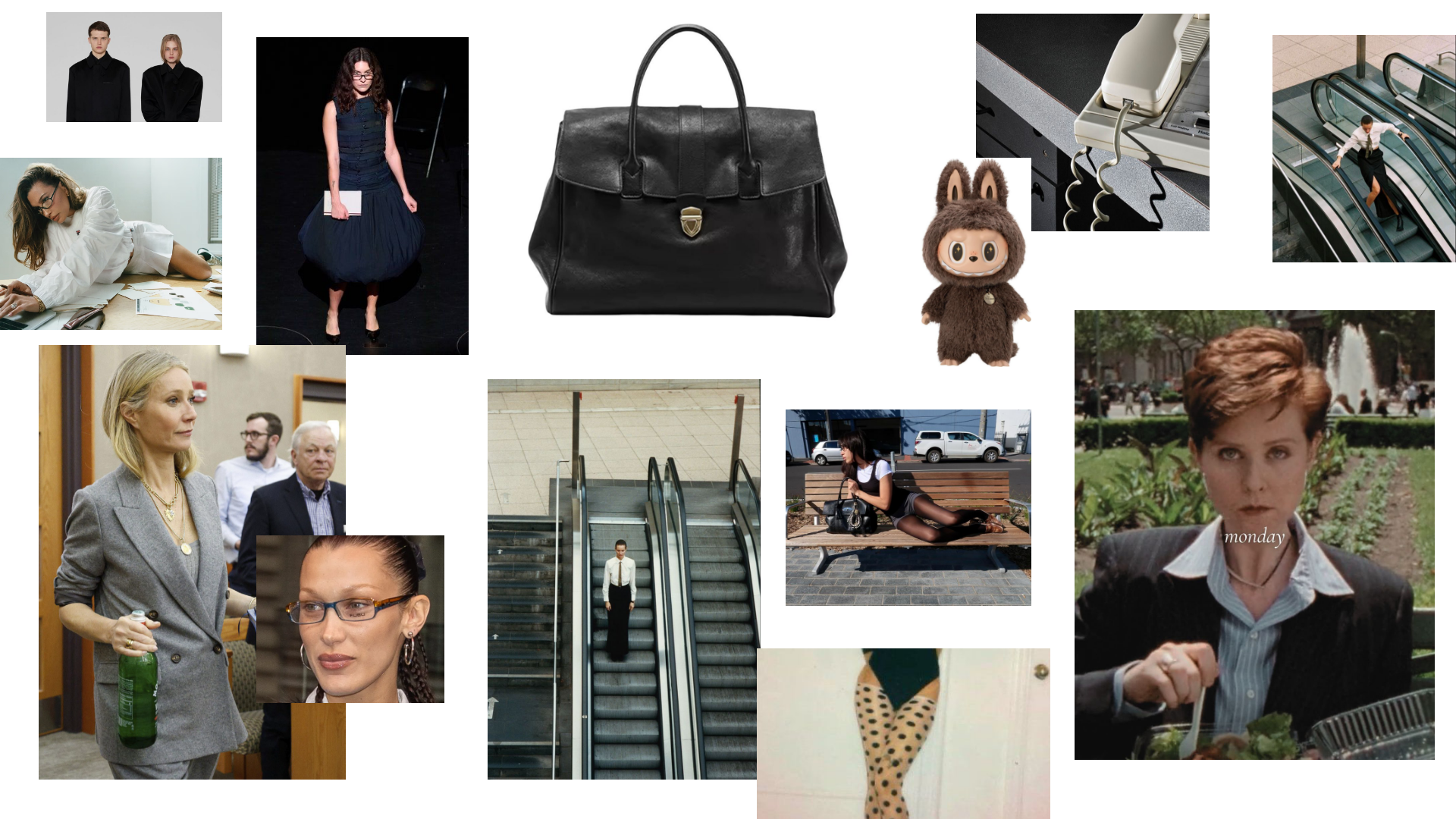
Moodboard / Visual Reference
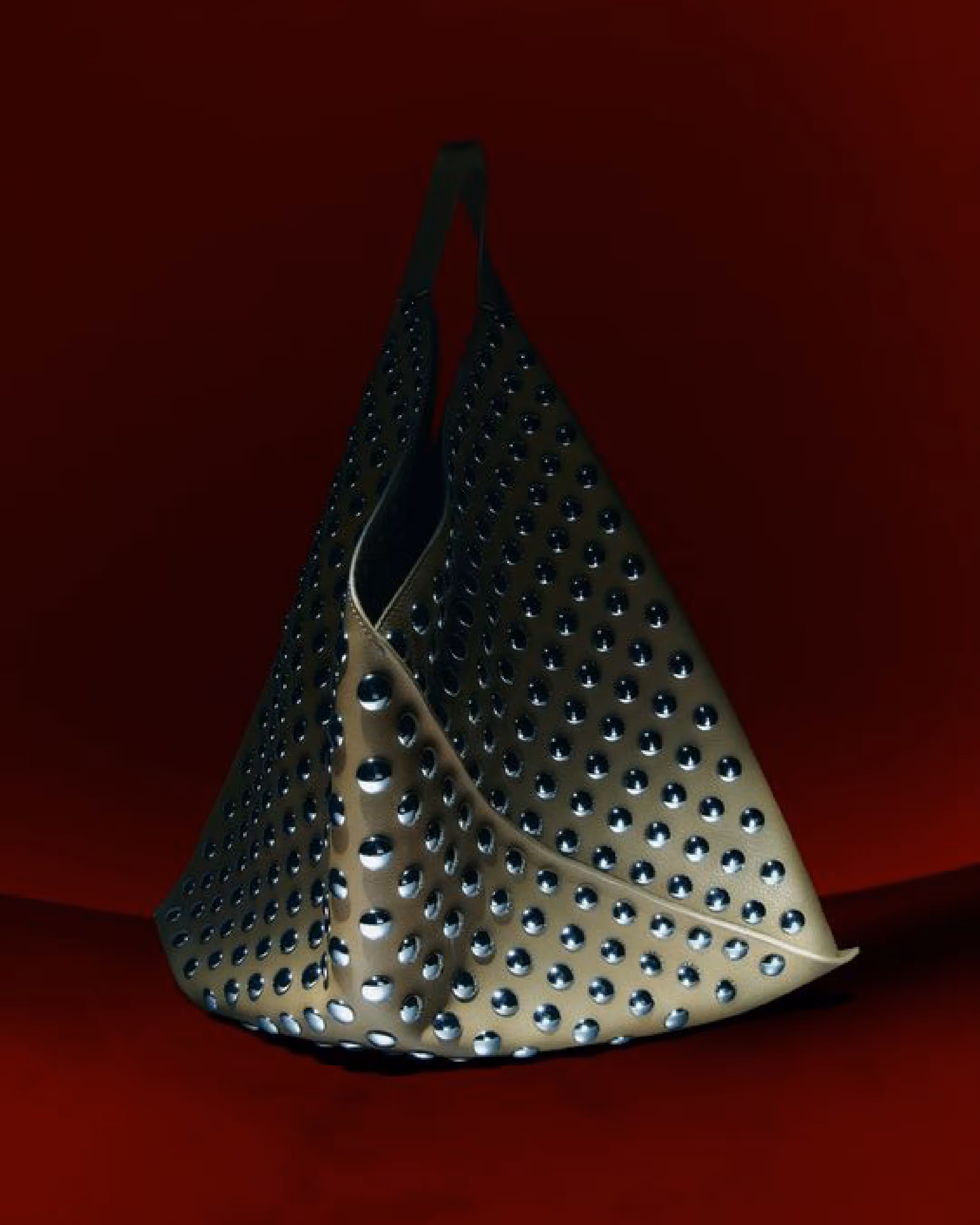
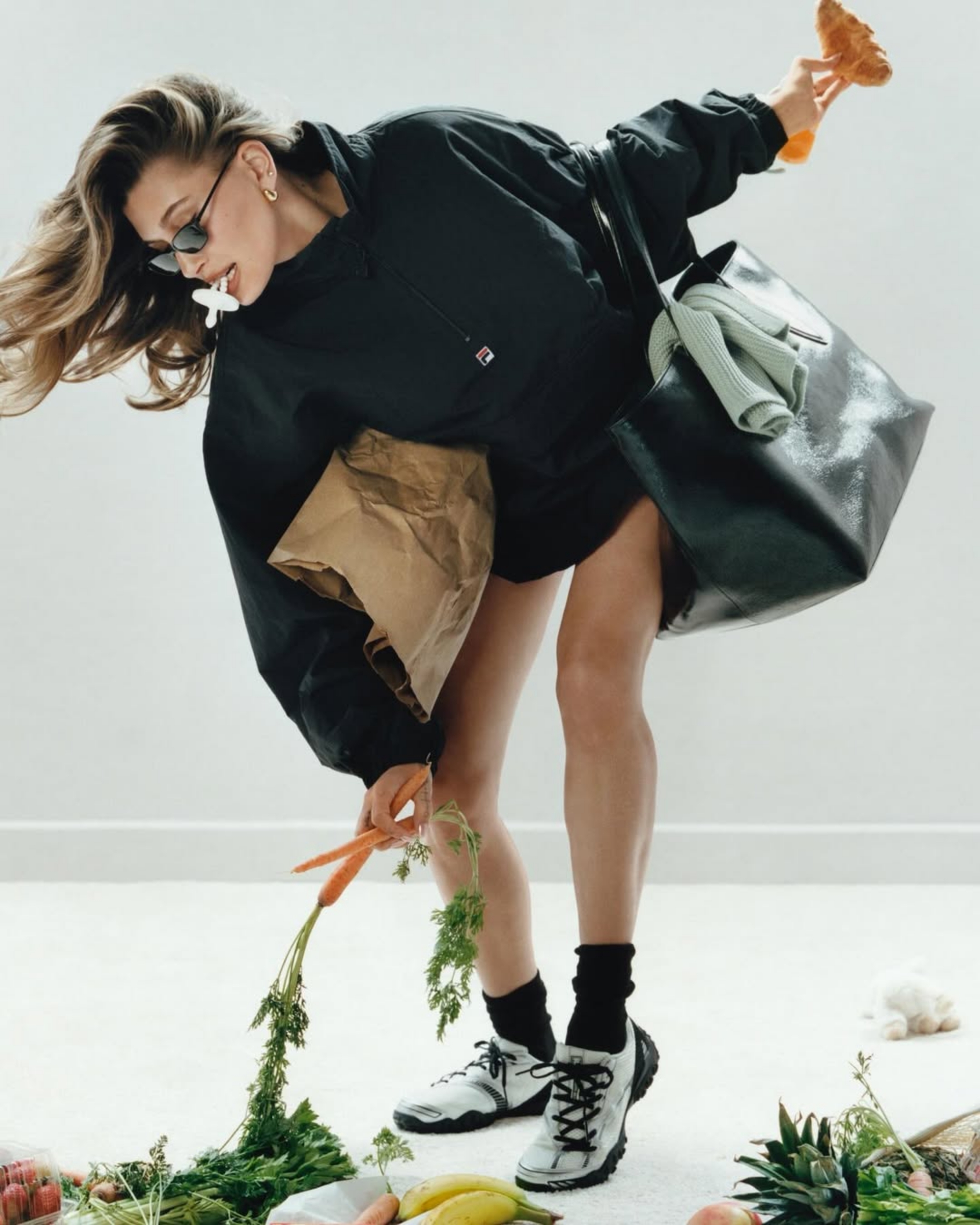
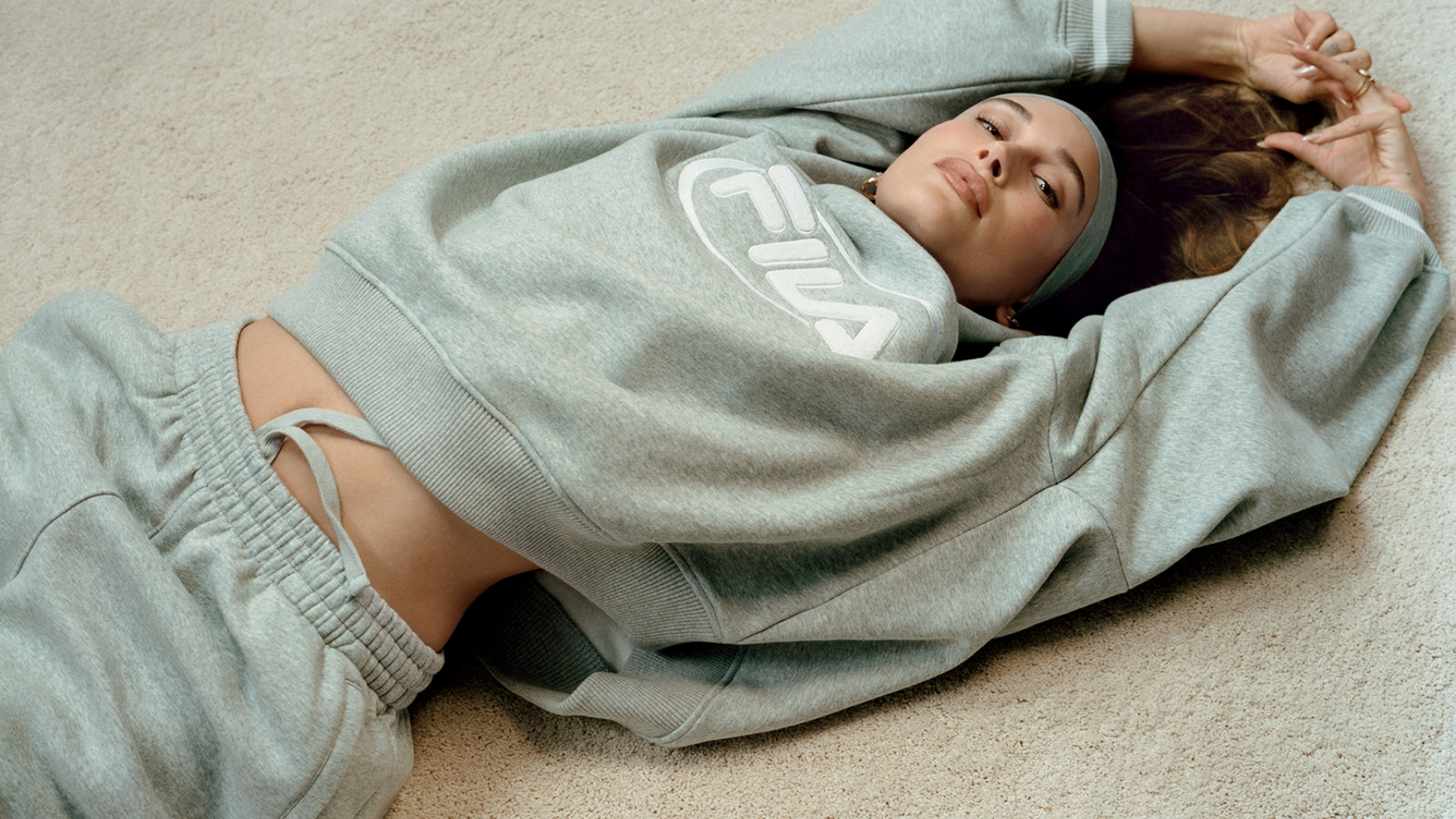
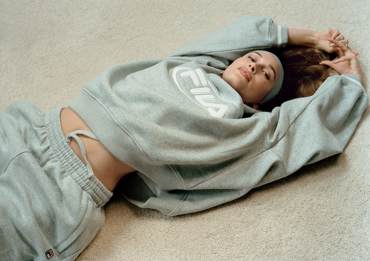
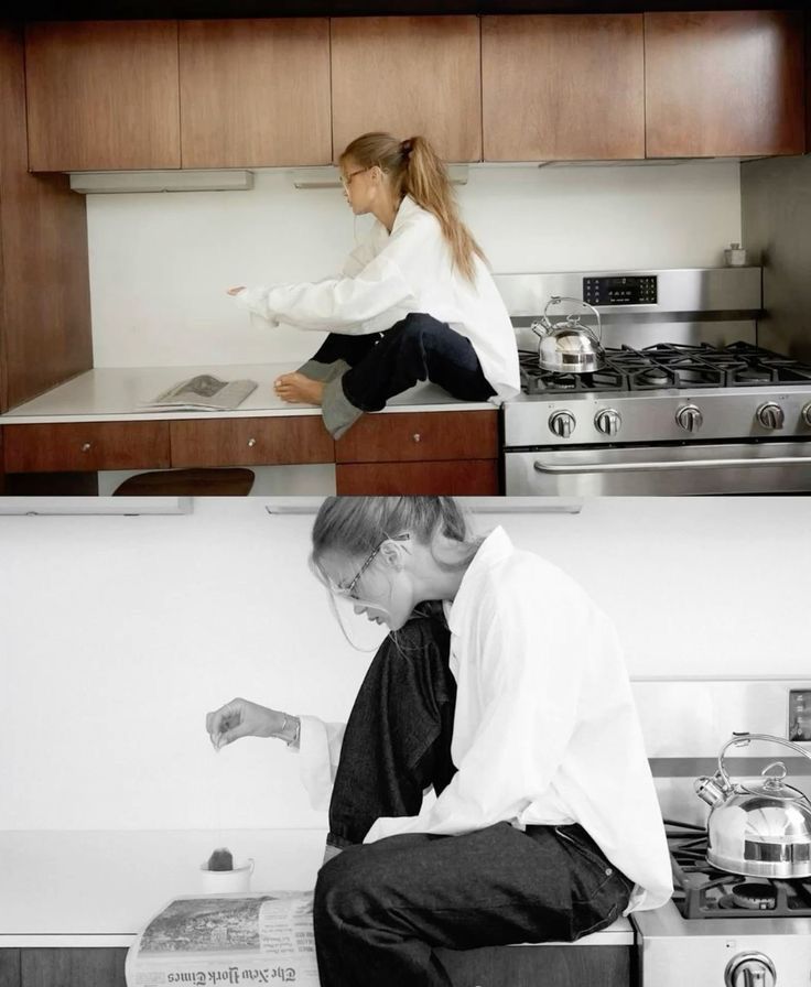
Recessioncore is built on texture. It’s the softness of worn denim, the scratch of wool, the grain of a low-light 35mm photo. Immediately I picture, long shadows, cool hues, quiet clothes. It leans into neutrals — stone, olive, charcoal, cream — but always with warmth and wear.
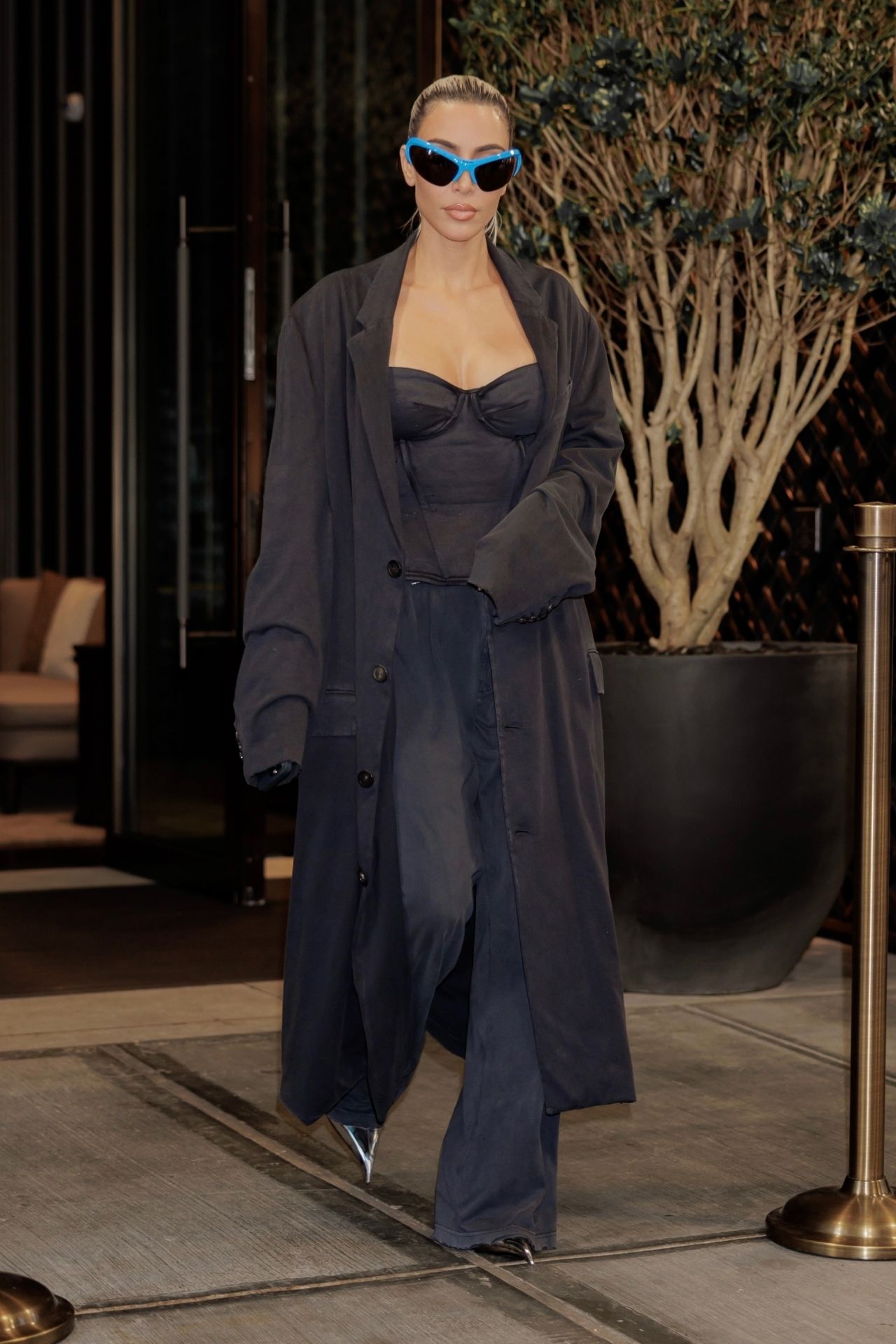
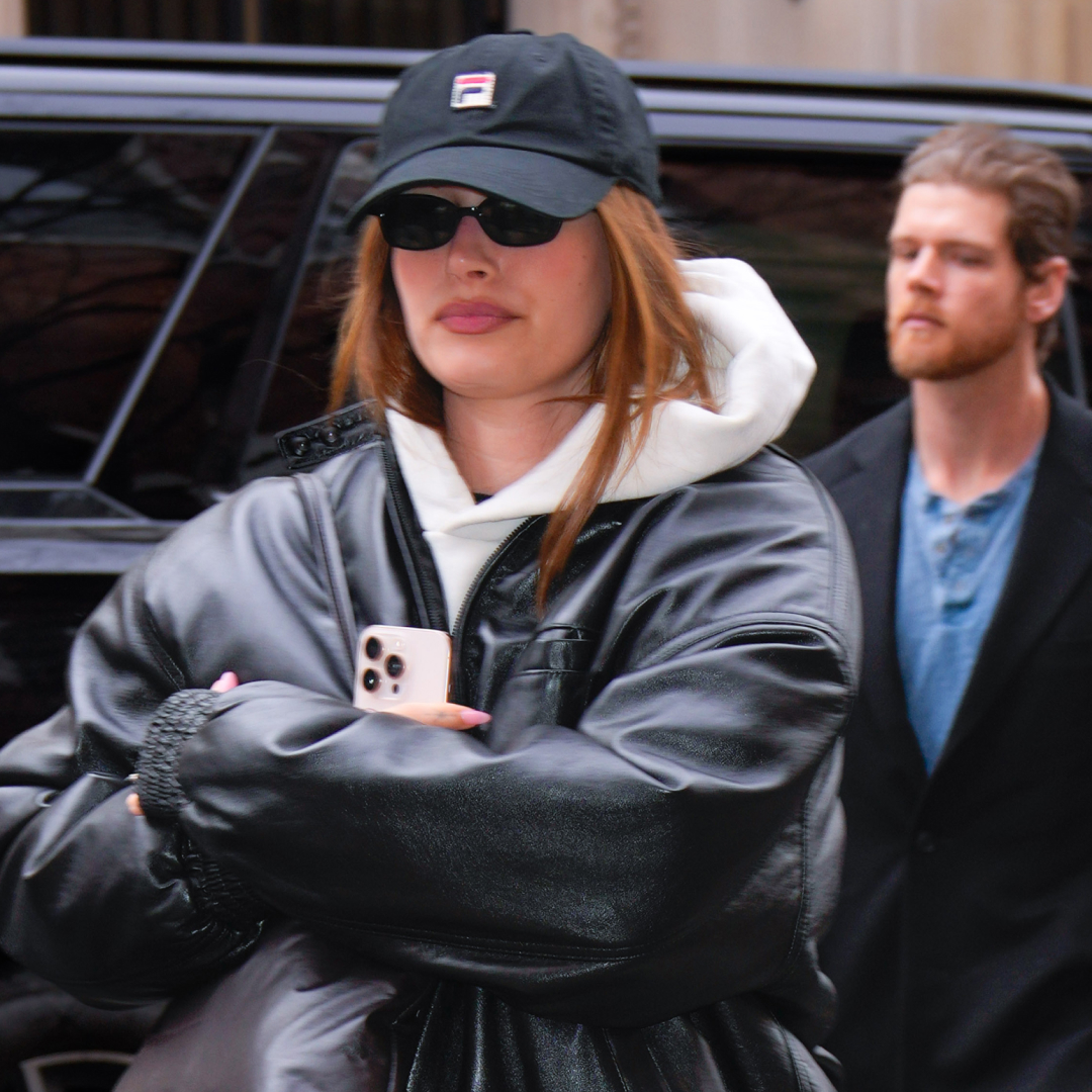
The silhouettes are oversized and practical: trench coats, cargos, thermal knits, repurposed corporate wear. Brands like Carhartt, Dickies, Uniqlo, and early Vetements nailed the brief long before it had a name. There’s something gently ironic in pairing a thrifted office skirt with a vintage hoodie and calling it fashion — and yet, that’s the point. It’s about taking what exists and recontextualizing it.
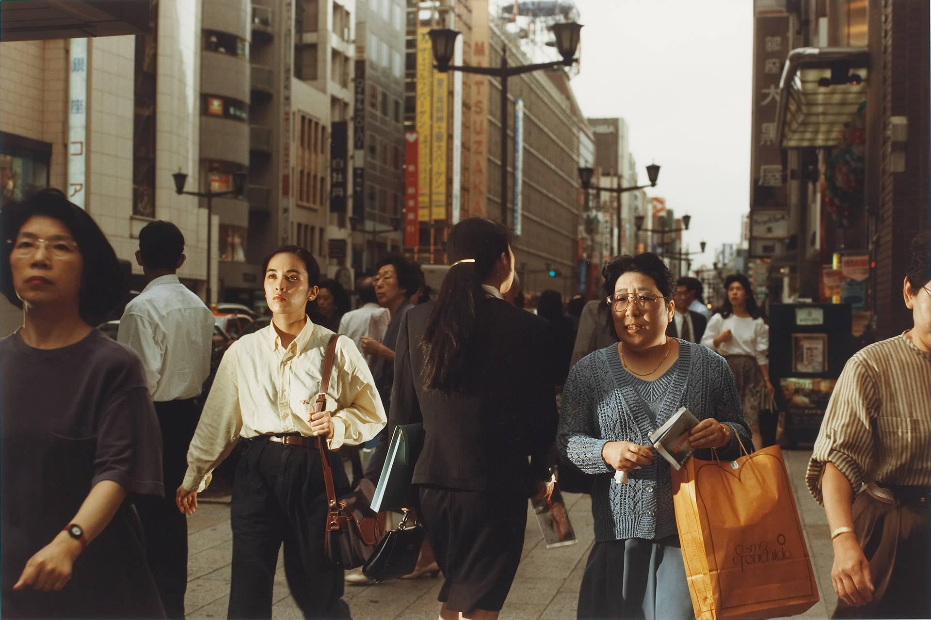
Settings matter too. Recessioncore doesn’t belong in a showroom — it belongs in back stairwells, strip malls, laundromats, and kitchens with fake marble countertops. Editorials shot in council flats. Beauty campaigns in real bathrooms. The vibe isn’t sad, but it is honest. It’s overcast on purpose.
Branding Breakdown
If I were branding Recessioncore, I’d start with colour. Of course it’s muted — that’s a given. But it’s not lifeless. There’s a richness to these neutrals: sandstone, olive drab, cool slate, warm taupe. The kind of palette that feels lived-in, not styled. These are the colours of things that already exist.
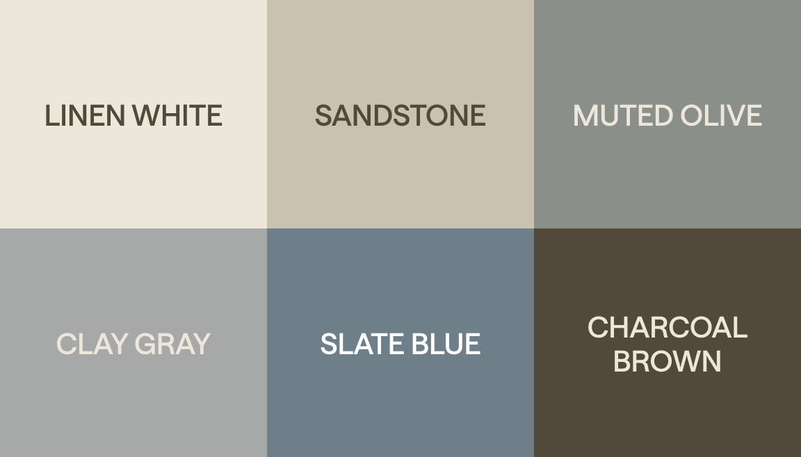
These aren’t the tones of quiet luxury; they’re the colours of making do and looking good doing it. I’m always drawn to a dusty olive or a blue that feels like an old work shirt — soft, almost matte, like the colour’s faded over time. Nothing flashy. Nothing fresh out the box.
Typography should feel equally functional — Helvetica Neue or DIN for the hero font: something Swiss, crisp, almost bureaucratic. I love Saans, shown below, by Displaay Type Foundry. Thinking outside the box; maybe paired with a typewriter-style serif, it nods to receipts, reports, old resumes. It shouldn’t feel curated, just… selected. That’s part of the charm. I’d avoid anything with too much flair — this is branding that wants to be understood, not admired.
Textures matter more here than finishes. A brand in this space doesn’t want slick. It wants grain. Film overlays, dust specs, paper creases. Even the digital design should feel analogue — like it’s been screen-printed, scanned, or half-loaded on dial-up. If there’s motion, keep it slow. Still frames over flash transitions. A little mess, a little melancholy.

Tone-wise, the copy needs to be straight-talking. Slightly tired, but clever. The kind of voice that says, “We know it’s bleak — here’s a good coat.” It’s not cynical, but it’s not trying to sell you a dream either. Think pragmatic warmth. A little dry. A little wry. An ad that says, “We know you’ve got bills. Here’s a moisturiser that won’t gaslight your bank account.”
Best For
Recessioncore isn’t for everyone. But it makes sense for the brands that want to opt out of the gloss.
It’s ideal for:
- Minimalist Fashion & Lifestyle Brands: Labels selling timeless staples or workwear basics (e.g. Everlane, COS, Muji, The Row) – anyone with a pared-down, quality-over-flash ethos. Brands that frame elegance as everyday life, not luxury theater.
- Resale/Thrift Platforms: Secondhand and consignment platforms (Vestiaire Collective, Depop, ThredUp, The RealReal) or vintage boutiques. Their focus on reuse and budget-savvy style perfectly aligns with Recessioncore’s recycled-chic image.
- Clean/Indie Beauty: Skincare and makeup brands with plain packaging and honest formulas (think The Ordinary, Aesop or minimalist indie lines). These beauty lines emphasize efficacy and “skin first” simplicity over glam. A muted, apothecary aesthetic is right on trend.
- Content Creators & Lifestyle Influencers: Bloggers or vloggers who preach sustainable living, DIY fashion, houseplant-filled apartments, or “quiet luxury” living. Their authentic storytelling (thrift hauls, slow mornings, diary-style posts) matches the tone. Sheerluxe- or Vogue-level edit blogs on modest living, as well as Gen Z influencers who dabble in budget travel and thrift flips, all fit this mood
If you’re selling aspiration, this isn’t your lane. But if you’re selling honesty, longevity, or small joy in a world that’s fraying at the seams — this is your space.
Execution Tips
The biggest mistake brands make when trying to ride an aesthetic like this is treating it like a costume. Recessioncore isn’t something you can slap on as an Instagram filter or mimic with a brown paper bag and a film preset. It works when it’s rooted in values. In choices.
So, if you’re doing thrift — mean it. Credit sources. Talk about circular fashion. Don’t aestheticize scarcity; celebrate sustainability. And if you’re minimalist, be minimalist. That means less copy, fewer SKUs, more intention. The language should feel real. No poetry, no fluff, just clarity.
Photography? Use natural light, no retouching. Show texture. Show wear. Show reality. People are tired of campaigns that feel like AI wrote them on a sugar high. If your campaign could double as a college zine from 2009, you're on the right track.
And finally: don’t patronise. If you’re talking about budgeting, make sure it doesn’t sound like a marketing ploy. If you’re referencing burnout, make sure you’re not glamorising it. The brands that pull this off best are the ones that live it — who don’t just reference the vibe, but actually reflect the mindset behind it.
Because in the end, Recessioncore isn’t just about the clothes or the fonts. It’s about the feeling: of trying, quietly. Of enduring. Of saying, “We’re still here — and we still look good.”


.svg)


.svg)
.svg)