The internet’s full of aesthetics. Most of them don’t come with a business plan. In How to Brand, we take the trends clogging your FYP and show you how to turn them into brand strategy — fonts, tones, textures and all. This time, we’re trading burnout for bougainvillea. Welcome to the slow, sun-warmed fantasy of Tomato Girl Summer.

Tomato Girl is summer’s most seductive fantasy: all linen dresses, Aperol lips, and the soft promise of escape. She's sun-drunk in Sicily, barefoot in Mallorca, spilling peaches down her blouse in the name of content. You’ve seen her. She’s wearing raffia. She’s holding a tomato like it’s an heirloom jewel. And somehow, she’s managed to romanticise seasonal produce into an entire personality.
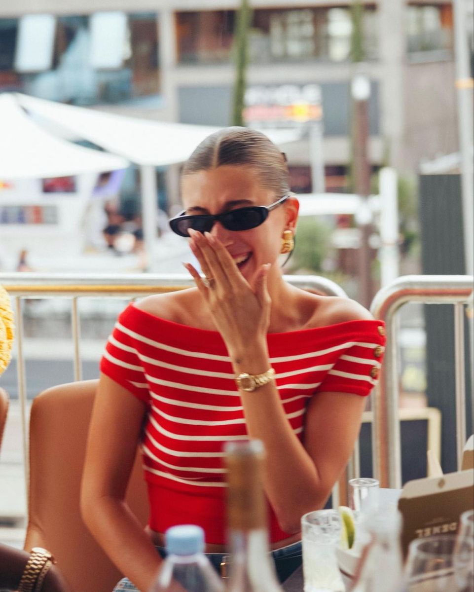
At its core, Tomato Girl (sometimes styled as Mediterranean Summer) is a blend of rustic slowness and fashion-led polish. It’s part Dolce Vita, part influencer-core, part “what if my life was a Luca Guadagnino film?” The aesthetic pulls from Mediterranean culture — terracotta, linen, olives, golden-hour everything — but filters it through a lens of TikTok escapism and summer-daydream chic.
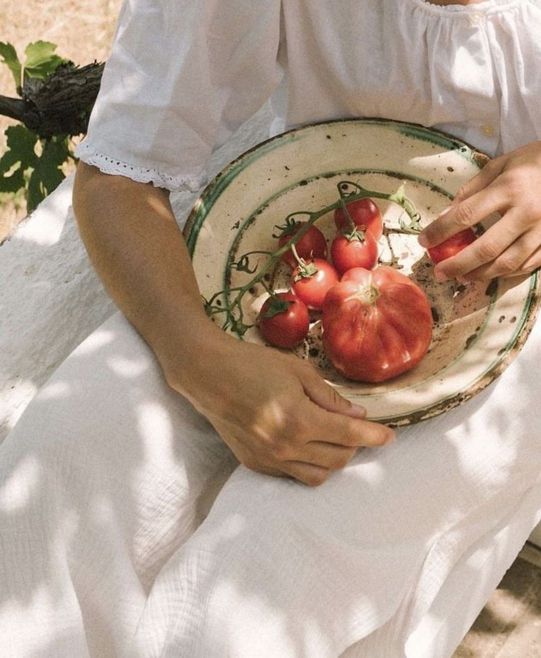
Culturally, it hits because it offers an opt-out. From grind culture. From sad desk lunches. From city heat and inboxes and £19 salads. Tomato Girl says: run away. Touch grass. Buy a lemon you didn’t need. It’s aspirational, but not in the sterile, quiet-luxury way — it’s textured, sensual, alive. It smells like olive oil and feels like the first cold sip of white wine at noon.
Moodboard / Visual Reference
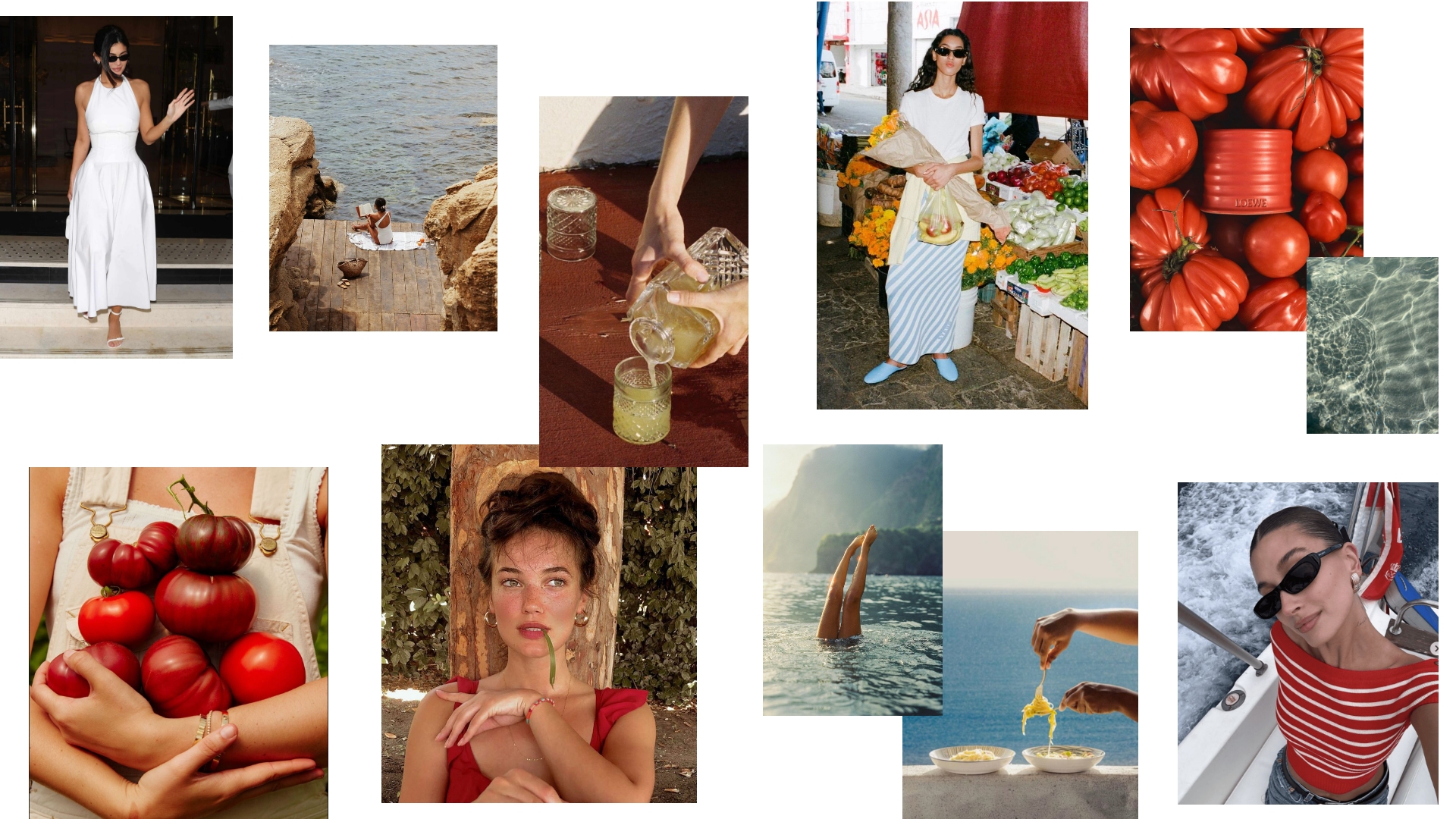
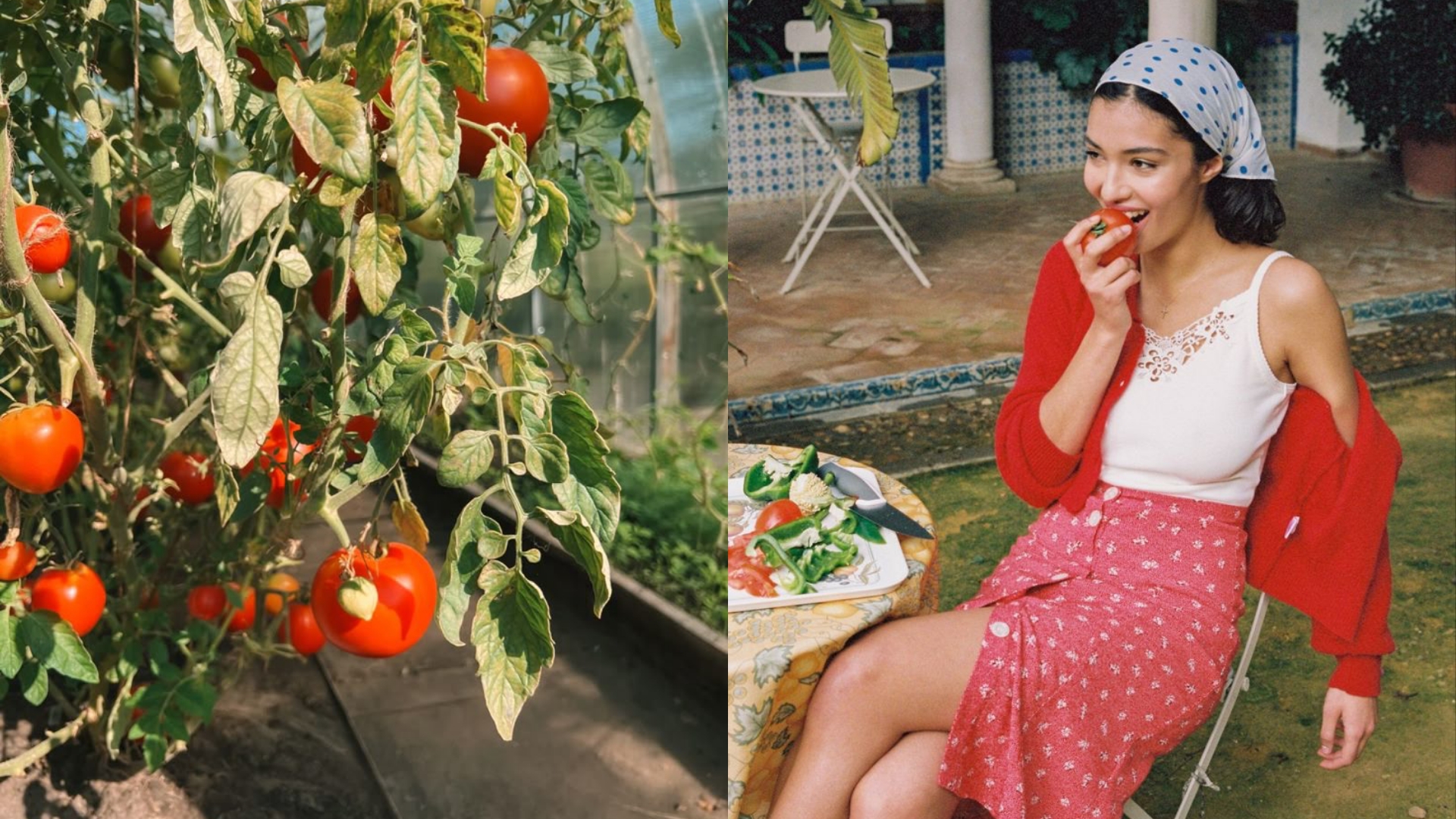
Visually, the Tomato Girl world is sun-soaked and slow. Think ripe red tomatoes on white tablecloths, linen shirts hanging off tanned shoulders, soft belly skin, fresh basil, chipped terracotta, unfiltered afternoon light. The colour palette leans warm — tomato red, of course, but also buttery cream, olive green, burnt orange, and a little sea-glass blue for balance. Nothing is neon. Everything feels like it’s been faded slightly by salt and sun.
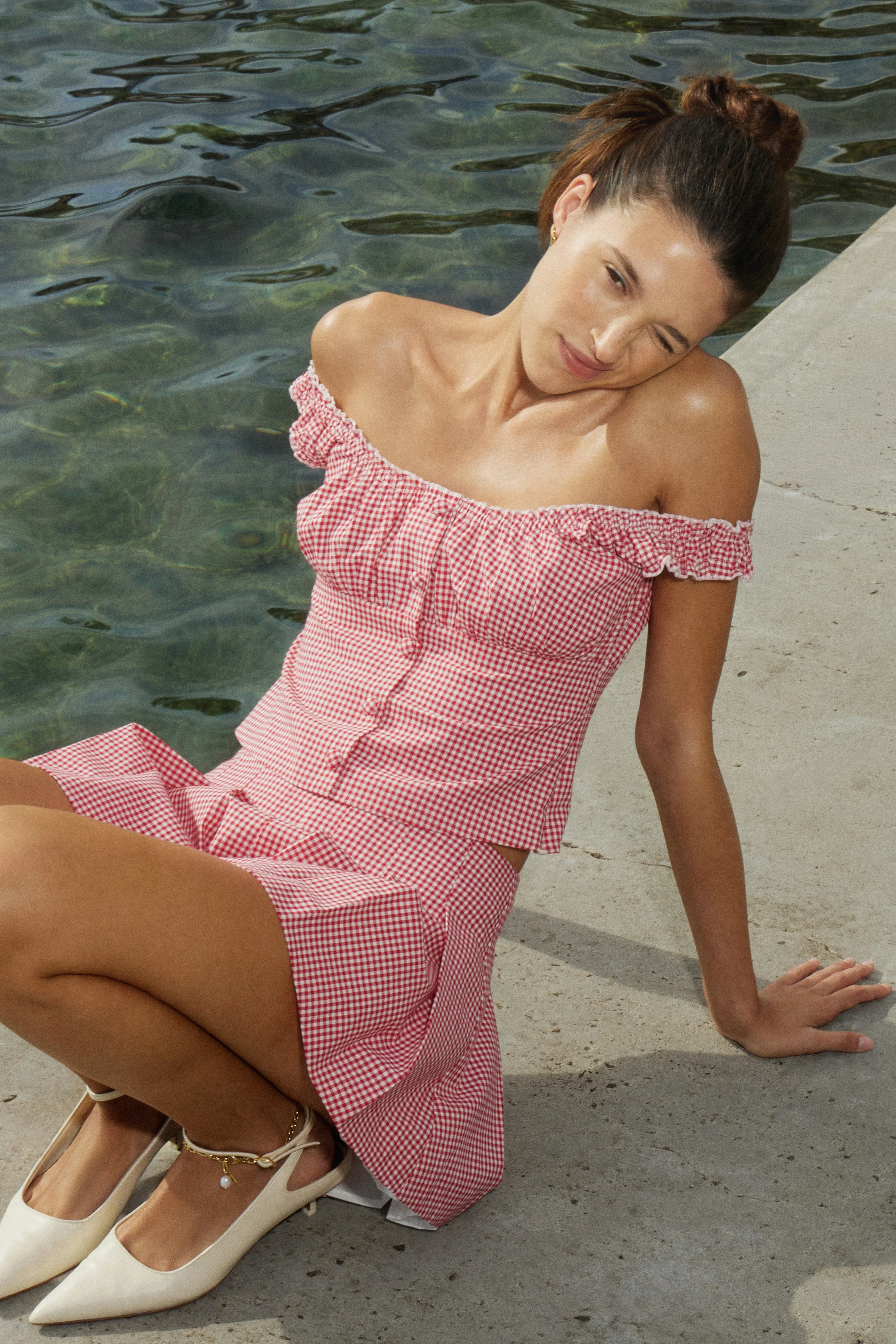
Textures are tactile: crinkled cotton, sun-dried linen, straw, raffia, ceramics. There’s a lot of skin, but never in a flashy way — it’s sensual, not sexual. Styling cues include silk scarves, gold hoops, espadrilles, vintage sunglasses, and woven basket bags that may or may not contain a paperback you’ll pretend to read. The lighting? Always golden hour. Always real. If it looks like it could’ve been shot on a 2007 Olympus point-and-shoot on the Amalfi coast — perfect.
The mood is nostalgic but not retro. Romantic but not girly. Somewhere between your Italian grandmother’s kitchen and a Jacquemus campaign styled by someone with heatstroke and good instincts.
Branding Breakdown
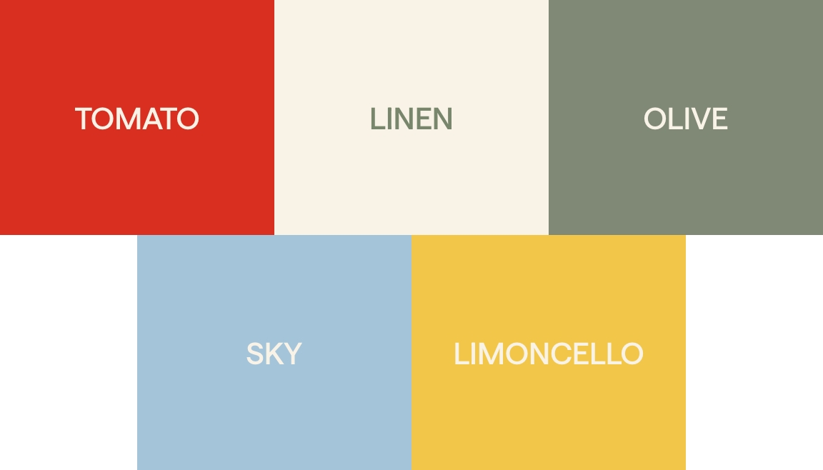
If I were building a brand around this concept, I'd lean on sun-kissed warmth and Italian romance, starting with the obvious: colour. But not just any red — it has to be sun-drenched, slightly bruised, and a little nostalgic. Not cherry. Not scarlet. Something warmer. The kind of red that bleeds into your linen napkin after lunch. That’s the core of the palette. I’d pair it with a washed-out cream (not white, never white — too clinical), a sandy beige, and a very soft olive green. Maybe a powdery blue for contrast — something that feels like Amalfi tiles faded from decades of sun. It should feel warm, tactile, and just a little edible.
The typography? I’d want something that feels like it came from a 1970s Italian cookbook. A high-contrast serif, definitely — something elegant but grounded, like Playfair or Romana, the kind of type that could appear on a bottle of limoncello or the menu at a beachside trattoria. For body copy, something softer and modern — a sans serif with good posture. The overall effect is a mix of polished sophistication (serif) with friendly, sun-warmed simplicity (sans). If appropriate, a hand-lettered script accent (a breezy, slightly irregular brush font) can be used sparingly, evoking handwritten espresso-bar notes. I'm quite in love with Morello by Andi Aukshanas.
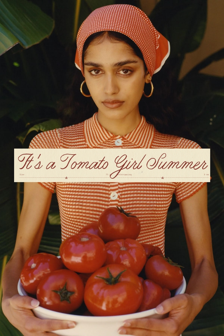
Design-wise, the whole thing has to feel touchable. I’d avoid anything glossy or overworked — give me crinkled paper, woven textures, linen folds, a light terracotta wash. I like a bit of grain, some imperfection. I’d layer textures — linen, ceramic, basket weave — into everything. Even the digital assets should feel slightly analog. Let things breathe. Give whitespace. No one’s rushing here.
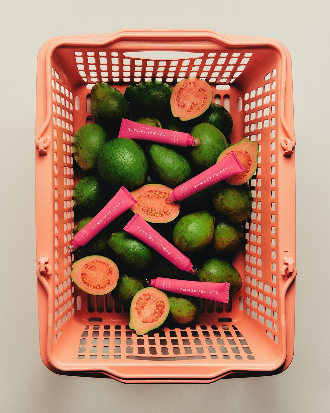
The tone of voice is maybe the most important part. It needs to be warm, effortless, and slightly amused. Like the kind of person who enjoys hosting. She’s not trying too hard — she just has taste. For example: “I discovered this linen top tucked away in a Positano market…”, or “Imagine dinner at our coastal table…” The copy should feel like a diary entry you’d want to steal. A little romantic, a little cheeky. It must stay authentic. As Vogue advises, always “keep whatever your point of view is as a brand…or have a sense of humour about it.”
No one wants to be sold to in this world — they want to be seduced. Or at least spoken to like they’re in on the mood. Think: “Your SPF is jealous,” or “We packed light: linen, lemons, and low expectations.” You’re building a world where everything is slower, softer, and just the right side of indulgent. The key is: confidence, warmth, and a wink, not pomposity.
Best For
This aesthetic works beautifully for brands that trade in feeling — not flash. Think:
- Fashion: Sun-obsessed womenswear, resort wear or boho labels (think a Jacquemus or Cult Gaia vibe). Breezy linen collections, straw-and-leather accessory lines, eyewear and swimwear with vintage silhouettes. Petaluma hats, espadrilles, linen suits – even kids’ summer lines or masculine resort tailoring can tap this theme. If your moodboard includes bows, sandals, straw or silk — you’re already halfway there.
- Beauty & Skincare: Brands with a focus on natural ingredients or “holiday glow.” Consider bronzers, sun-care (like a luminous SPF), or citrusy fragrances. Indie brands (e.g. organic olive-oil soaps or Aperol-scented mists) can lean in. An example: Malin+Goetz hosted a poolside pop-up in Spain complete with signature SPF cocktails – the kind of branded experience this look inspires. Even packaging can borrow tile motifs or terracotta jars.
- Home & Lifestyle: Think artisanal decor: Italian-terracotta pottery, woven throws, linen bedding, and sun-print candles. A boutique hotel or villa rental business would use this style, as would cafes/restaurants (slow-cooked brunch spots with Mediterranean menus). Even travel or food subscription boxes can brand themselves with this warm, regional flair.
- Personal Brands: Influencers or entrepreneurs who embody slow Mediterranean leisure – travel bloggers capturing Positano or Sicily, lifestyle gurus selling “slow living,” or creative coaches weaving Italian lore into their narrative. This aesthetic turns one’s Instagram feed into a glossy Italian fashion magazine spread.
Execution
- Embrace Depth (not costume): Anchor the aesthetic in real cultural cues rather than cliché props. Don’t slap tomato graphics on everything. Instead, highlight authentic detail: an heirloom recipe (pasta al pomodoro), a local artisan (hand-painted majolica tile), or an old family photo at the Amalfi coast. In copy and visuals, name-drop places and traditions (Limoncello de Sorrento, Sardinian weavers) to lend credibility. Let each brand’s unique POV shine – be witty or self-aware rather than trying too hard.
- Celebrate Craft & Texture: Lean into artisanal textures everywhere. Use linen textiles in product shots, feature wicker baskets or terracotta planters on set. In graphic work, consider a subtle jute-paper background or watercolour wash. Highlight handmade touches in products (e.g. “hand-cracked seashell detailing” or “woven by Positano artisans”) to avoid flat digital polish. Telling those material stories gives the aesthetic soul.
- Slow Living & Sensuality: Weave in the value of taking your time. Highlight rituals and touch sensations (warm sun on skin, the smell of fresh basil, the taste of olive oil). For example, language like “savor the golden hour,” or visuals of a lazy seaside meal convey this. Feather & Black’s guide puts it nicely: “embrace a slower pace of life…sink into the soothing serenity of your own Mediterranean escape”. Use that feeling: portray lingering, unhurried moments to invite customers in.
- Tone & Humor: Keep it light. The aesthetic already has romantic gravitas, so allow copy to have a sly wink. Avoid sounding like an overeager travel brochure. If you reference trends (“hot girl summer to tomato girl summer”), do it playfully. One viral-tip found: readers want to be part of the joke, not lectured. So your voice can drop a joke (“Vespa not included.”) or pose a fun challenge (“Channeling 1950s Italian film set vibes: one arm, two strappy sandals.”) to stay relatable. Always loop back to authenticity – as marketing experts say, each brand has its own story, so own yours instead of just echoing the aesthetic mindlessly.



.svg)


.svg)
.svg)
