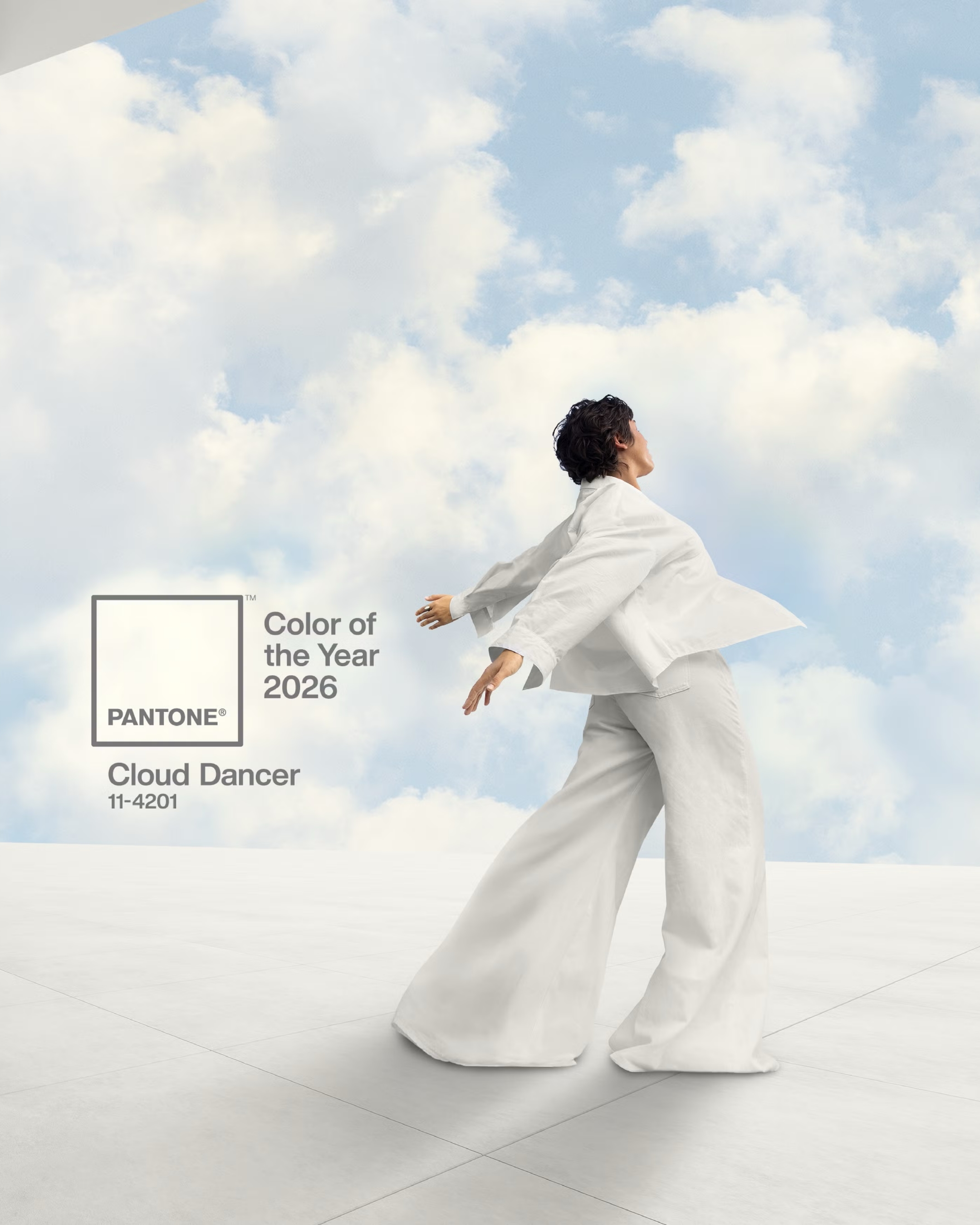
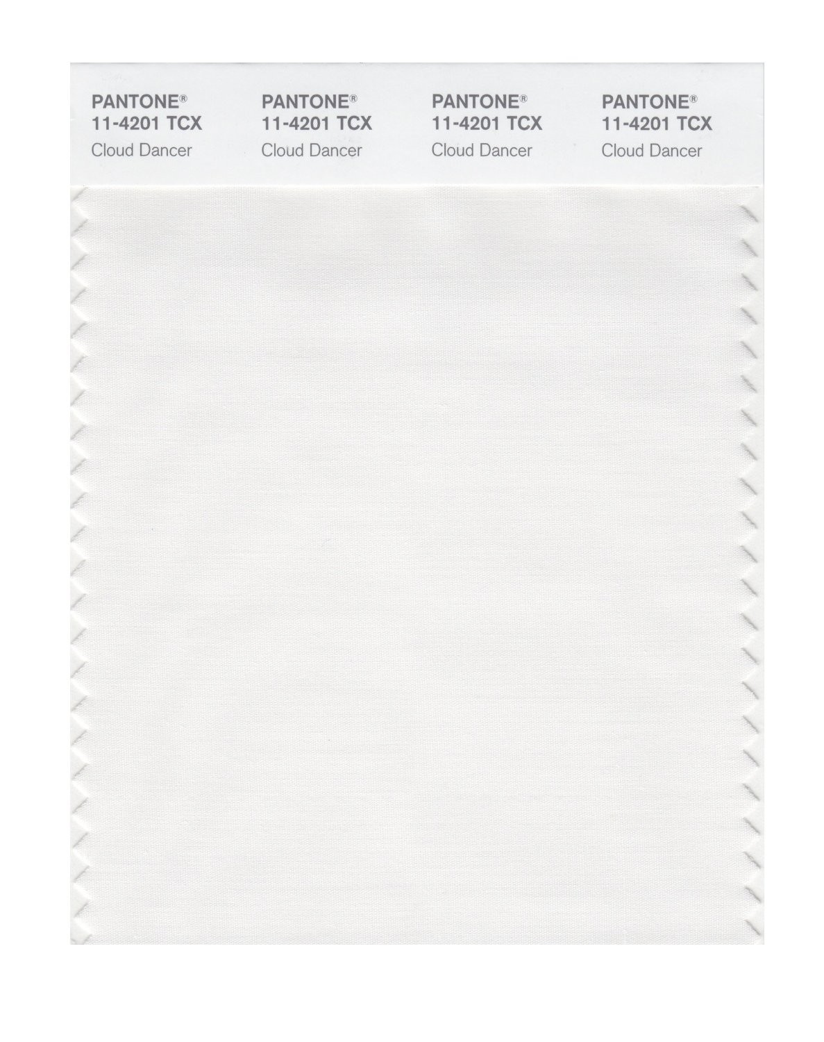
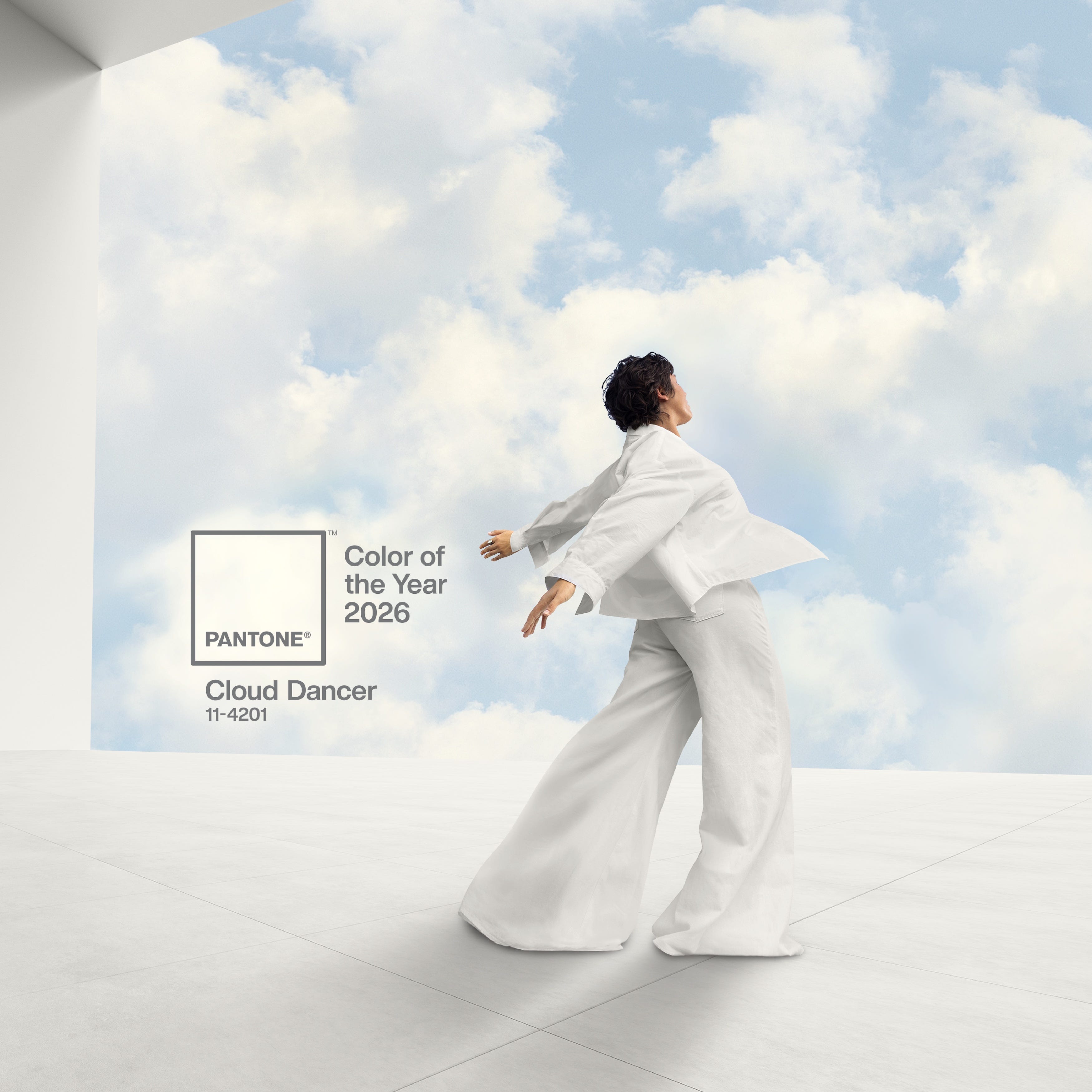
Cloud Dancer is described as billowy and calm. It has warmth, which makes it more forgiving than a stark gallery white, and enough depth to feel intentional rather than empty. Pantone’s reasoning is simple. After years of saturated palettes and visual noise, designers and consumers are searching for clarity, space and a sense of calm. Cloud Dancer reflects this shift toward reset and restraint.
Why this matters now
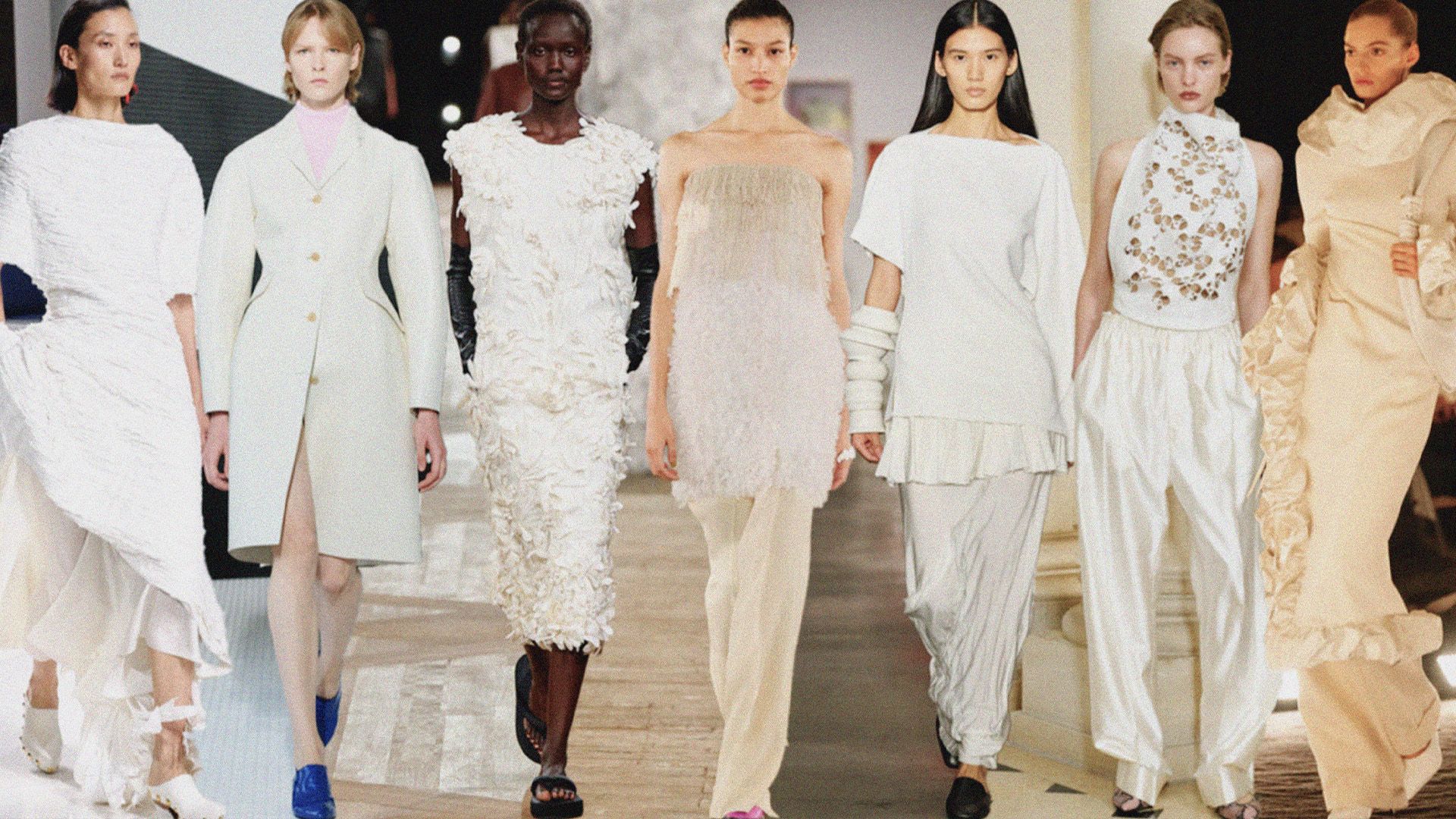
There is a cultural appetite for simplicity. Fashion has moved from maximal prints to cleaner silhouettes. Beauty is celebrating skin rather than colour. Interiors have leaned back toward natural texture and softness. Cloud Dancer fits into that wider mood. It gives objects and spaces room to breathe. It also acts as a neutral foundation that supports whatever sits on top of it. The focus becomes texture, line and shape rather than colour alone.
There is another side to consider. Some critics have already questioned whether choosing white is playing it too safe. On its own, Cloud Dancer can read as blank or muted. The effect depends entirely on how it is used. Thoughtful application is essential.
How brands can use Cloud Dancer
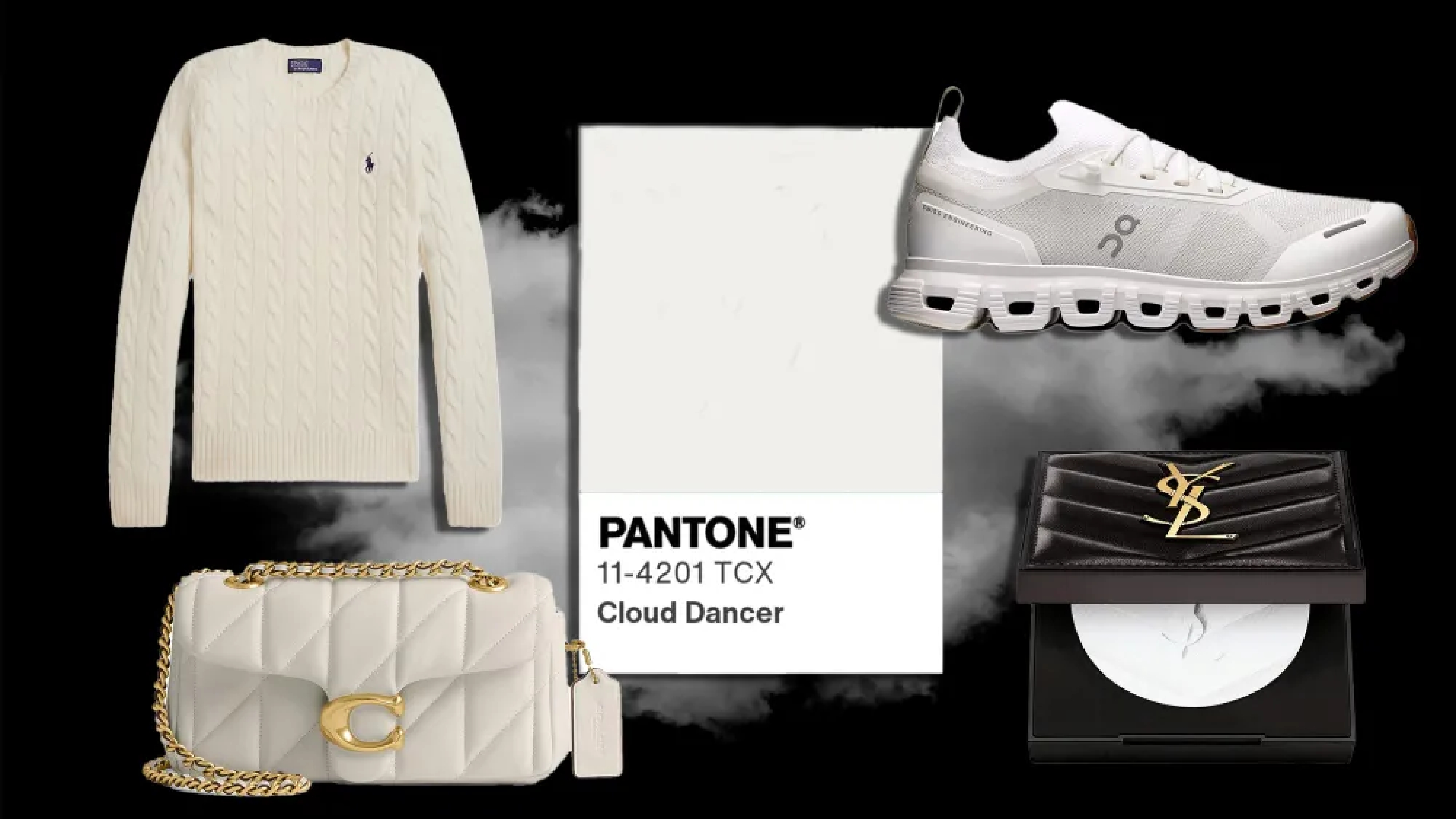
For branding and visual identity, Cloud Dancer works as a base tone that lets typography and photography speak with clarity. It is useful for minimal packaging, clean digital layouts and quiet luxury positioning. In fashion, the shade is already appearing in tonal knitwear, cotton shirting and soft tailoring. The emphasis is on movement and material rather than colour.
Texture is important here. Pair Cloud Dancer with brushed metal, untreated wood, natural stone or soft touch papers to avoid an overly clinical feel. Accent colours become more visible and more expressive against it. Deep brown, muted green and warm peach all sit well with this white.
The bigger picture
Pantone’s selections often reflect larger emotional or social trends. The last few years have brought us peach, brown and magenta. Cloud Dancer is a clear break from that optimism and indulgence. It signals calm, clarity and a return to essentials.
In a year filled with noise, Cloud Dancer offers a pause. It is not telling us what to think or feel. It invites a blank page, a reset and a chance to create with intention.


.svg)


.svg)
.svg)