I've built brands across beauty, hospitality, fashion, and wellness. Fragrance is the category that humbles every designer eventually – because the central challenge has no clean solution. You are selling something invisible. You cannot photograph a scent. You cannot let the product speak for itself in the way a lipstick shade or a skincare texture can. Everything the customer feels before they open the bottle has to be manufactured through colour, form, and material. In fragrance branding, the visual identity isn't support material. It is the product experience.
Most founders entering the fragrance space understand this intellectually and underestimate it practically. They focus on the juice – the brief, the nose, the notes – and treat the branding as downstream work. It isn't. The colour you choose for your bottle, your box, your campaign will determine what your fragrance smells like to a customer who has never encountered it. That's not a metaphor. It's colour psychology, and the fragrance industry runs on it.
Why colour has to do what the nose can't
Scent and colour share neural territory. Research in crossmodal perception (the way our senses interact and borrow from each other) consistently shows that humans associate specific colours with specific smell categories before any olfactory input is received. Warm amber and burnt sienna signal spice, resin, warmth. Pale green reads as fresh-cut, botanical, herbal. Deep navy or matte black encodes as mysterious, smoky, animalic. Soft blush reads as skin, intimacy, the barely-there. These aren't arbitrary associations; they are cognitive shortcuts formed over a lifetime of sensory experience, and your customer is running them the moment they see your brand.
The established visual grammar of legacy perfumery was clear glass, gold hardware, black or white type, and the occasional deep amber or nude tint as a nod to the juice inside. The bottle communicated luxury and withheld everything else, leaving the fragrance to make its own case. That worked when distribution was department store counters and the customer expected to be educated by a sales associate. It works less well when your customer is discovering you on a phone screen and has three seconds to understand what you are.
The newer generation of fragrance brands has figured this out. They're using colour not as decoration but as direct sensory communication and the ones doing it best have turned the coloured bottle into the most efficient brief their customer will ever receive.
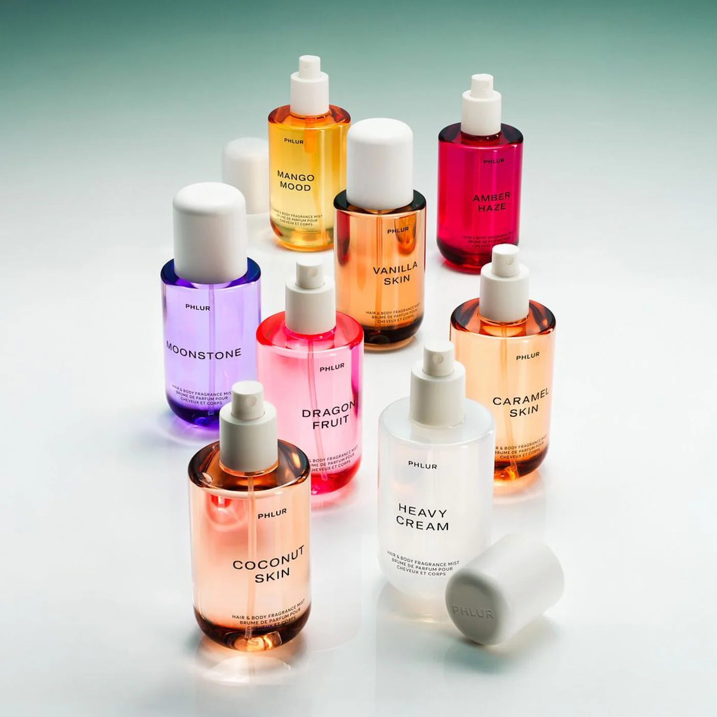
Phlur might be the clearest example of colour doing exactly what it's supposed to do: translating scent into visual information before a word is read. The Matcha Milk bottle is matte sage green. Berry Cream is soft pink. Vanilla Skin is warm beige. Heavy Cream is a cloudy, milky white. The colour-to-scent mapping is almost one-to-one, and that's the entire strategy.
What makes this more than a clever packaging exercise is the consistency of the logic. Every bottle in the range applies the same principle – the colour is the scent summary. A customer who has never encountered the brand can pick up Mango Mood (a warm amber-orange), Dragon Fruit (a saturated fuchsia), or Moonstone (a cool lavender) and form an accurate expectation of what's inside without reading a single note. The visual identity has collapsed the gap between discovery and comprehension. For a brand selling body mists in a crowded, accessible market, that speed of understanding is a commercial asset.

The campaign imagery doubles down on it. Phlur shoots its products alongside their real-world flavour references – a matcha latte next to Matcha Milk, a bowl of berries beside Berry Cream. The effect is almost synesthetic. The customer isn't being told what it smells like; they're being shown a world the scent belongs to, and the colour is the thread connecting the visual to the olfactory. It's direct, populist, and extremely well-executed.

Where Phlur uses colour to say this smells like this, LORE uses it to say this feels like this and the distinction is everything.
Launched in September 2025, LORE was built around a reversed creative process. Founder Kerrilynn Bender didn't start with olfactory references. She started with feelings, memories, and specific sensory moments – developing the fragrances with French perfumer Jérôme Epinette (the nose behind Byredo's Gypsy Water) using poetry, imagery, and emotional briefs rather than traditional references. The resulting fragrances are described not by notes but by worlds. Sublimity is a group of friends in a truck driving to a secret beach in Hawaii, specifically the moment of diving under the first wave. Somewhere But Nowhere is a cabin: leather, smoke, cedar. Disfruta is a mezcal cocktail. Lovely and a Little Twisted is Versailles stuck through the looking glass.
The flacons (inspired by the glasswork of André Thuret, priced at $888 for 50ml) are deliberately beautiful and deliberately coloured. And the colours aren't translating scent notes; they're carrying emotional weight. This is colour doing something more complex than Phlur's literal mapping. It's telling you that what's inside is layered, evocative, not easily categorised. The bottles feel like objects from somewhere else, which is exactly what the brand is selling – not a scent, but a world you haven't visited yet. LORE's tagline is "each scent is a galaxy and we're the night sky." The colour makes you believe it before you've opened anything.
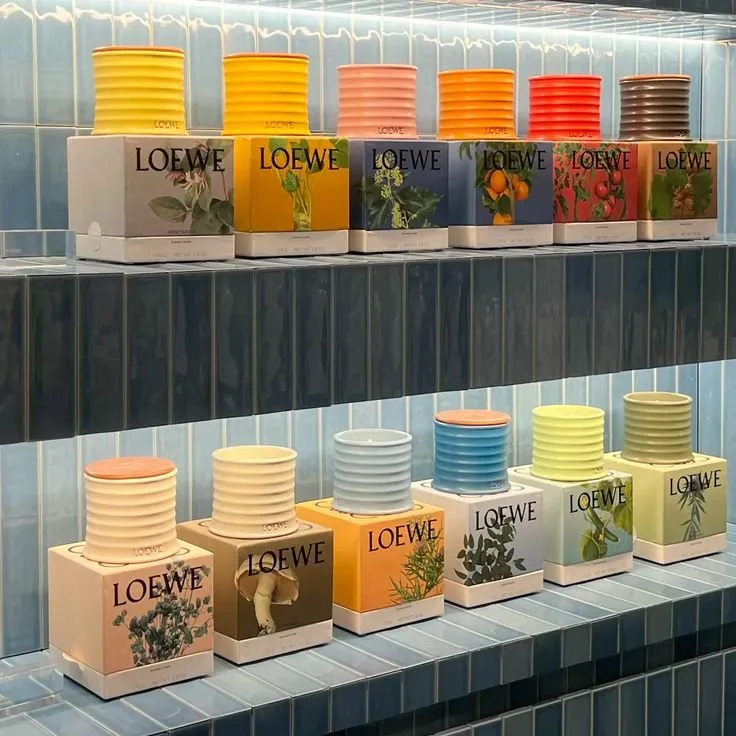
Loewe operates at a different scale and demonstrates that colour strategy in fragrance isn't a single choice but rather it's a system. Part of their collection uses coloured glass bottles that shade from pale silver-grey down through olive, terracotta, and deep red-brown, each colour corresponding to a different botanical world. The visual progression reads like a walk through a landscape. Then there's the candle range, which does the opposite – bold, saturated, maximalist colour on the ceramic vessel, paired with botanical illustration on the box. Bright yellows, coral, sky blue, sage. These are objects you display.
What Loewe understands is that colour strategy can flex across product categories without losing coherence, as long as the underlying logic is consistent. The fragrance bottles are refined and narrative. The candles are expressive and joyful. Both are unmistakably Loewe, and both use colour to communicate something specific about what's inside. The brand also maintains lines in clear glass with consistent white labelling and colour-differentiated lids — a system that works across retail environments where shelf recognition matters. It's colour strategy applied at every tier of the product range, with a different intention at each.
Campaign is the third act
If the bottle is the first impression, the campaign is where the colour argument is either confirmed or abandoned. The brands getting this right are building campaign worlds that are colour-consistent with the product. The palette of the bottle extends into the shoot, the set, the lighting, the props. The customer who discovers the brand through a campaign image and then encounters the product in store should feel like they've arrived somewhere they've already been.
When campaign and product aren't in colour dialogue, the brand experience fractures. The customer's subconscious registers a mismatch, the bottle promised one thing, the campaign delivered another, and trust erodes without them knowing why. This is the downstream cost of treating packaging and marketing as separate workstreams. In fragrance, they are the same conversation.
The practical implication for founders
If you're building a fragrance brand, colour is not a packaging decision. It's a brand strategy decision that has to be made in dialogue with the fragrance brief, the campaign concept, and the customer's first encounter, in whatever order those happen. Ask what your fragrance should feel like before it's smelled, and build a colour language that answers that question honestly. Literally, like Phlur. Emotionally, like LORE. Systematically, like Loewe. The method is yours to choose. What isn't optional is having one.
The coloured bottle isn't a trend. It's a correction. The industry spent decades asking customers to trust a clear bottle and a name. The brands winning now are doing the sensory work upfront: letting the colour make the case so the juice can simply confirm it.


.svg)


.svg)
.svg)