There's a gap in brand design that doesn't get talked about nearly enough. It sits between the strategy document and the first visual concept, and most designers leap clean over it.
The research gets done. The positioning gets written. The audience is defined, the competitive landscape mapped. Then the design tool opens and something that looks good starts taking shape – with no real bridge between what the brand needs to say and what it ends up looking like. The colours are trendy. The typography is safe. The whole identity could belong to any brand in the same category, and often it does.
That bridge – the one between strategy and visual – is the hardest part of the work. It's also the most important.
Strategy that doesn't inform design is just a document
Strong brand strategies exist everywhere. Sharp positioning, clear audience insight, a real point of view on market differentiation. And then visual identities follow that have nothing to do with any of it. The disconnect happens when strategy is treated as a box to tick rather than a foundation to build from.
If the positioning says "elevated but approachable" and the identity looks indistinguishable from every other DTC skincare brand on the market, the strategy failed – not because it was wrong, but because nobody used it.
What translation actually looks like
The move from strategy to visual requires an intentional middle step. Taking strategic pillars – positioning, audience, personality, competitive context – and turning them into visual territories before anything gets designed.
If a brand is positioned as refined and quietly confident, what does that actually look like? Not in the abstract. What typography carries that tone without tipping into cold or corporate? What colour palettes create the right emotional register? What imagery, spacing, and visual rhythm positions the brand where it needs to sit?
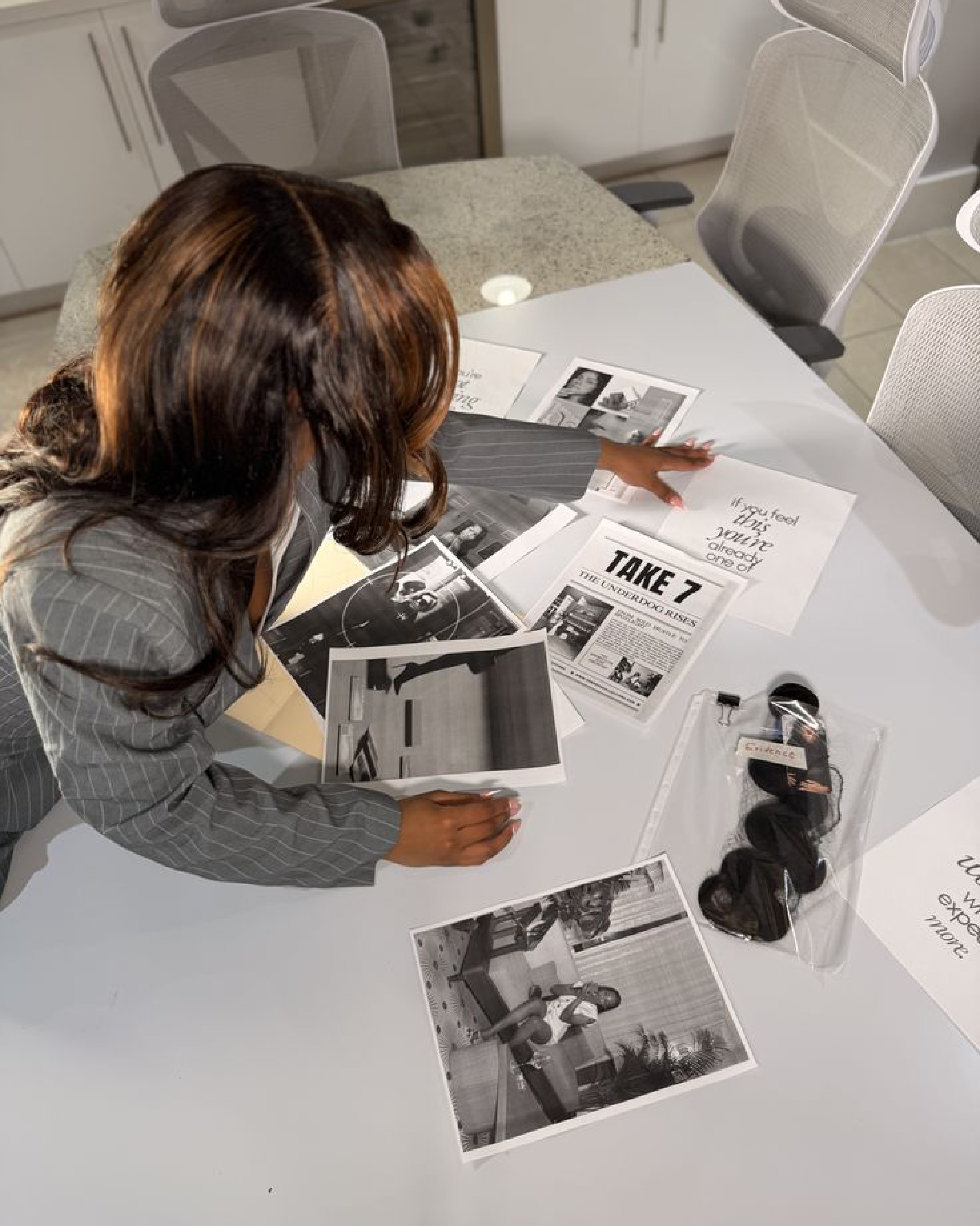
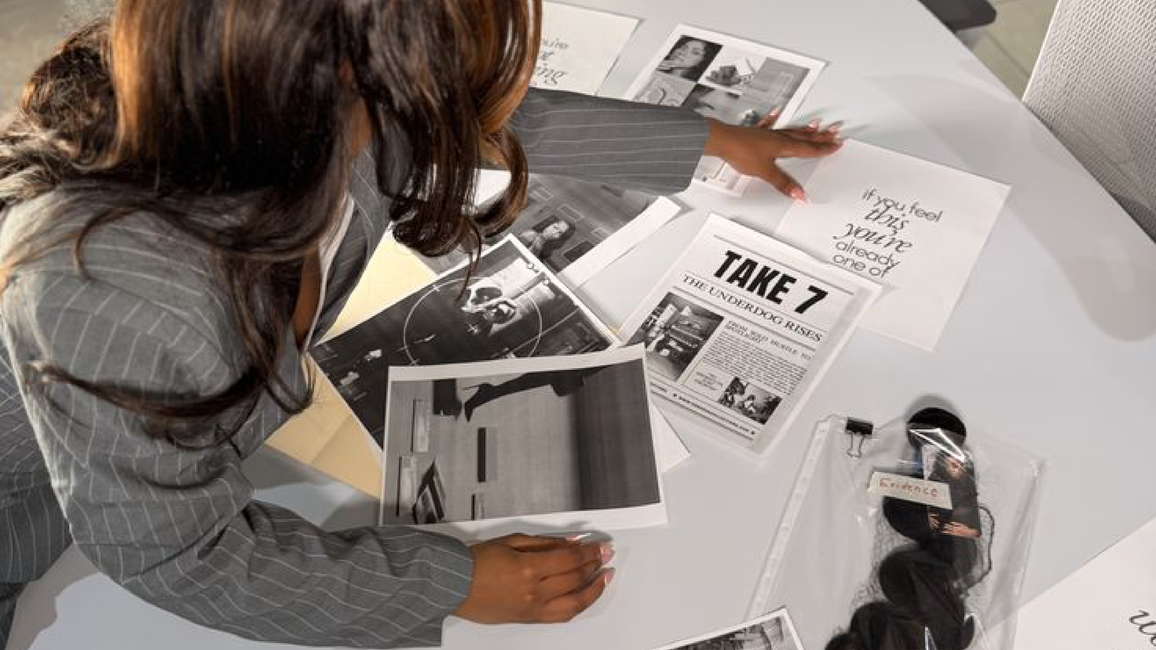
This is where mood boards stop being Pinterest dumps and start functioning as strategic tools. Every image earns its place by representing something from the strategy. Not by looking nice.
Showing the thread changes the conversation
One of the most valuable things in a brand presentation is making the connection visible. Walking a client from strategic insight to visual decision. "The audience values craft and attention to detail – that's why the typeface is a serif with refined letterforms and generous spacing. It communicates precision without being sterile."
When clients see the logic behind the aesthetics, the whole dynamic shifts. Feedback moves from personal taste to strategic evaluation. That's a fundamentally different conversation – and a much more productive one.
The skill that changes a career
Designers who can translate strategy into visuals are rarer than expected. Most can do one or the other – strategic thinkers who struggle to execute, or strong visual designers who can't explain their reasoning beyond "it felt right." Being able to do both, consistently, is the shift from executing someone else's creative direction to owning your own.


.svg)


.svg)
.svg)