I’ve realised that the branding I’m drawn to isn’t necessarily loud or groundbreaking. It’s the quiet details. The things you might not clock straight away, but once you do, you can’t unsee them. The textures, finishes, and choices that make something feel considered rather than overdesigned.
These are the branding moments I keep noticing in my work, in my clients’ brands. The moments that feel considered, romantic, and just… chic. These are the things I think about long after I’ve seen them. The ones I instinctively save, screenshot, and come back to again and again.
Here are 23 branding things I absolutely love right now...
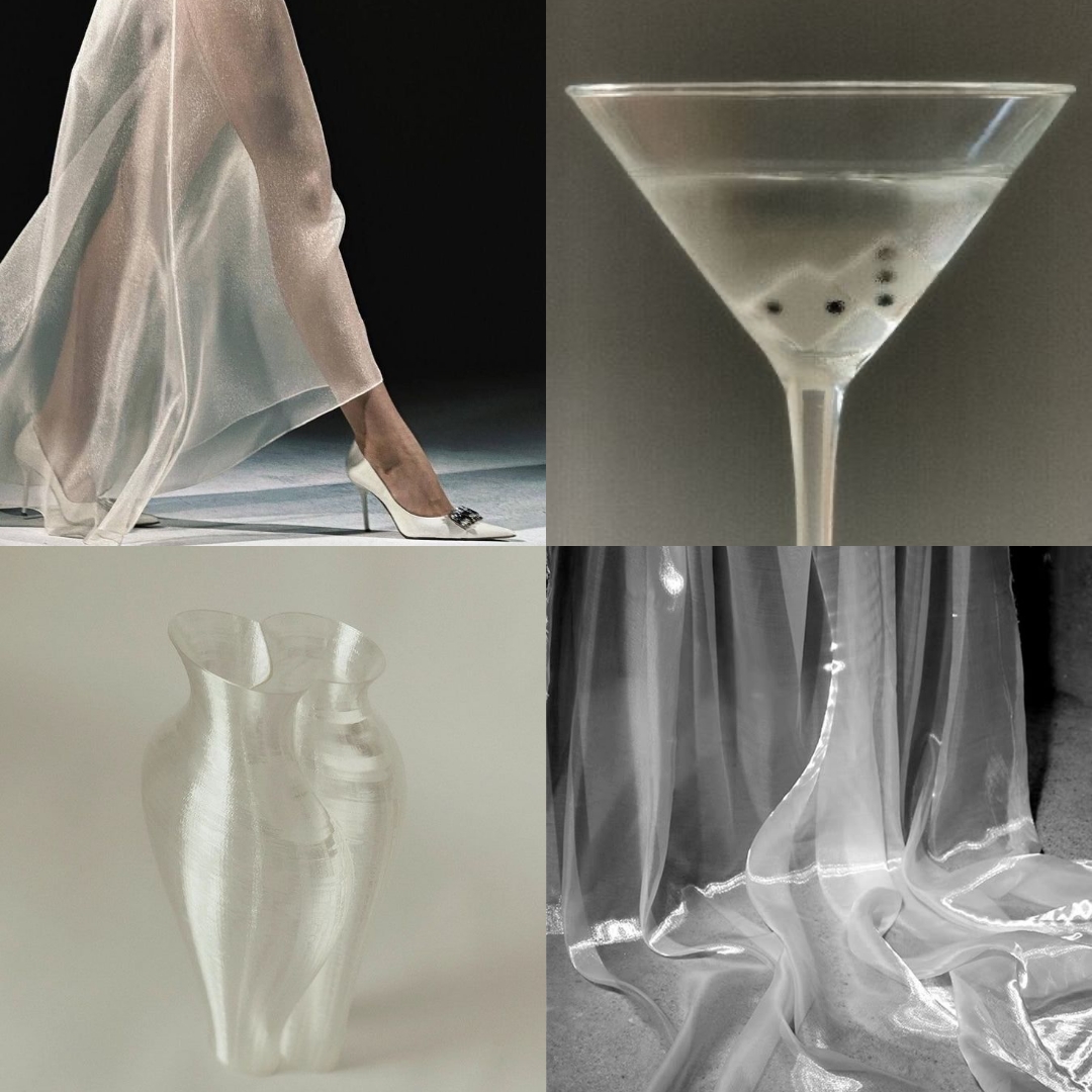
1/ Sheer, Shimmery Textures
I’m obsessed! Light, airy, almost-there textures that feel soft and breathable. They add elegance without trying too hard and instantly make everything feel elevated.
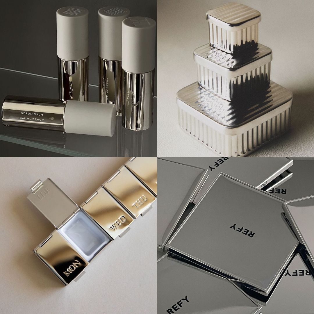
2/ Chrome & Metallic Packaging
I love metallic packaging when it’s done subtly. Soft chrome, brushed finishes, muted reflections. It feels modern, cool, and a little futuristic but still chic.
3/ Transparent Vellum
Vellum makes everything feel more thoughtful. Especially when it’s used with something as simple as paper. I also love what it allows you to do with layering. If you’ve ever watched one of those Instagram moodboard reels and wondered how they’ve added so much depth without clutter, it’s probably vellum. Very cool. Very in right now.

4/ Metal Embossing
This is becoming a bigger and bigger trend, especially in events and stationery. Think invitations, place cards, menus. It’s such a small detail and actually pretty easy to achieve, but it instantly signals quality. I love how subtle it is, yet how much it elevates the overall experience.

5/ Envelopes with Detail
Scalloped edges, embossing, unusual folds. I’m OBSESSED with envelopes that feel special. They set the tone before you’ve even opened anything. How special doe it feel to recieve something that feels so thoughtful and beautifully designed.

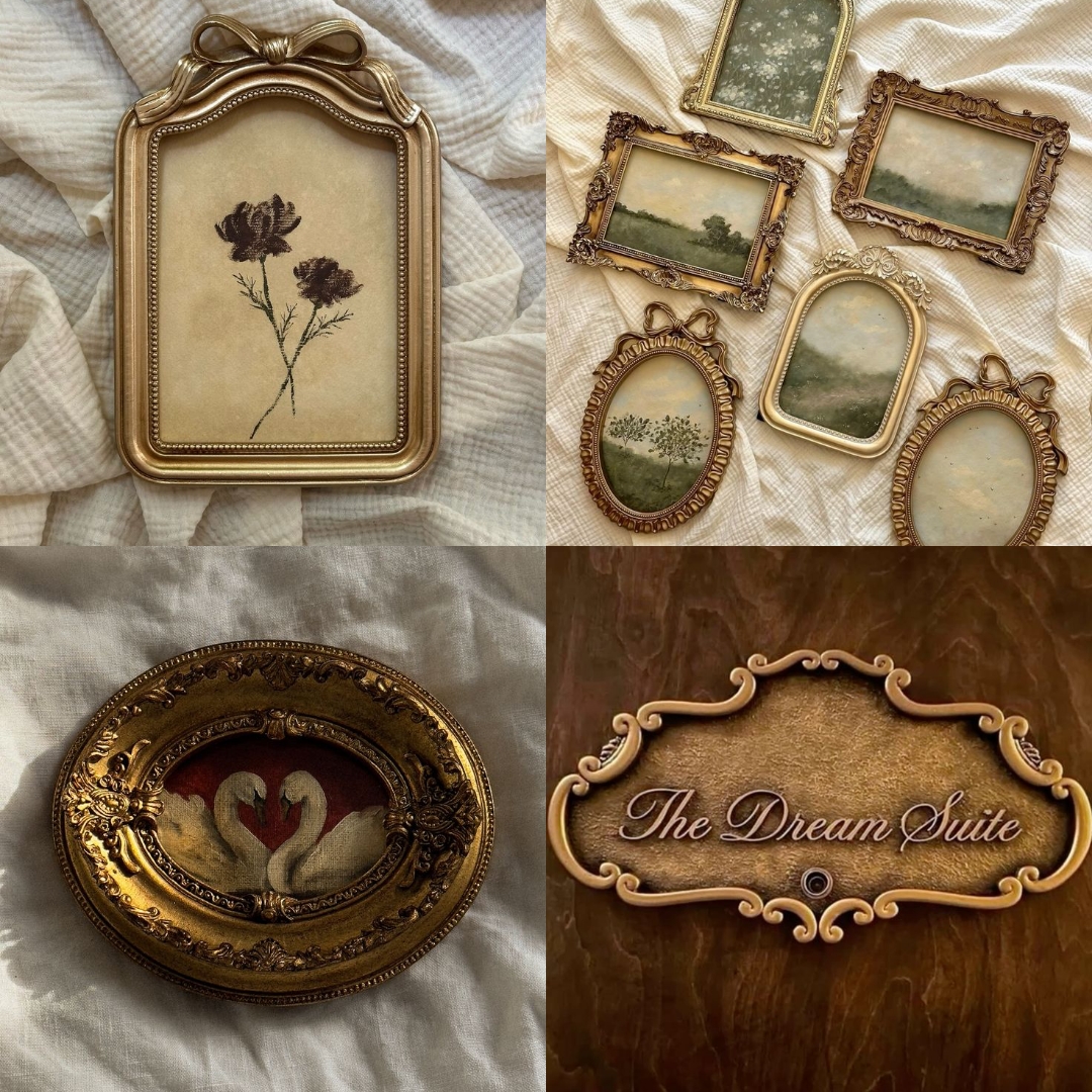
6/ Gold & Bronze Framing
There’s something so romantic about gold and bronze frames. They feel old-world, elegant, and slightly nostalgic like something you’d find in a gallery or an archive.
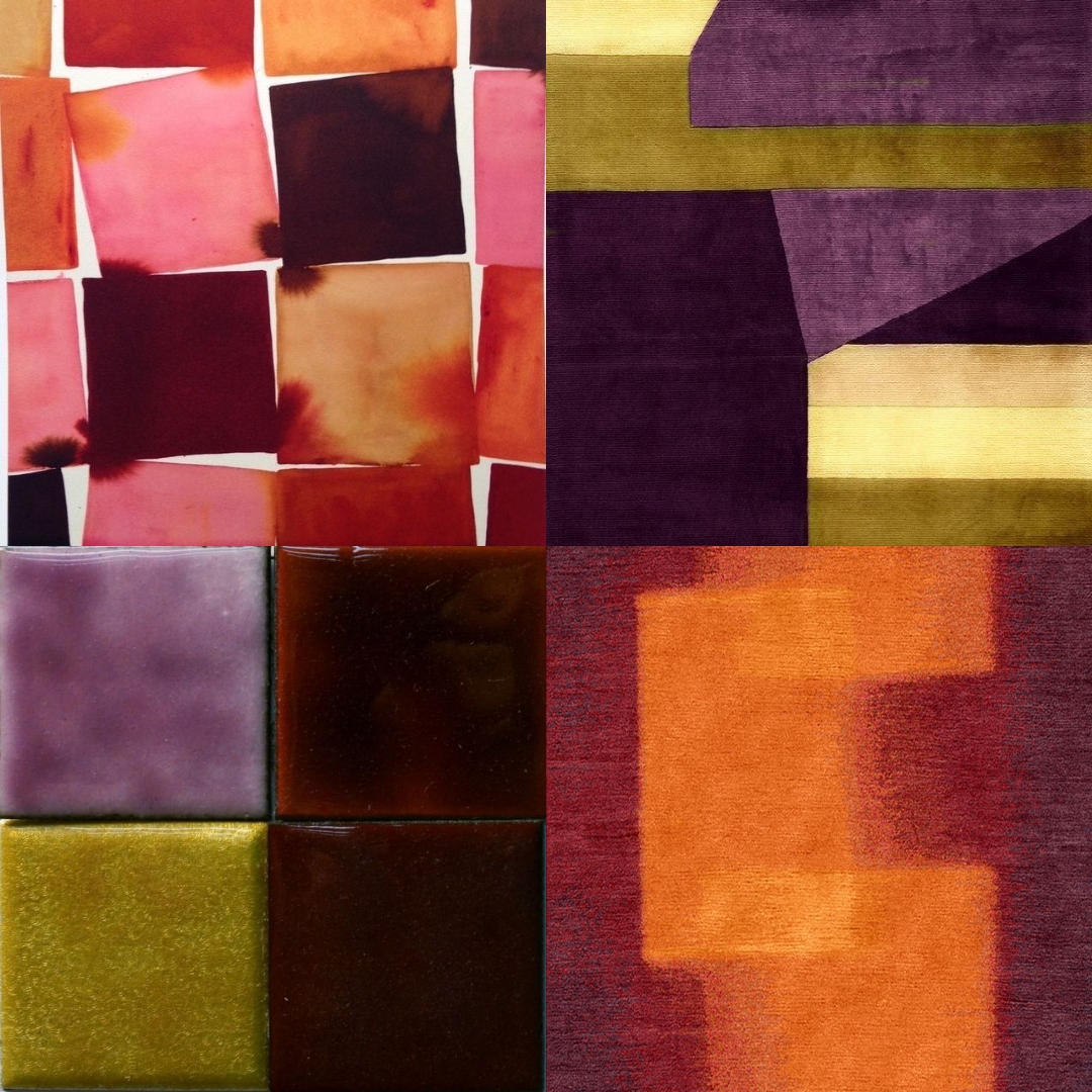
7/ Colour Blocking
Soft, painterly colour blocking over harsh graphic lines. I love when colours meet imperfectly. It feels more human and less over-designed.
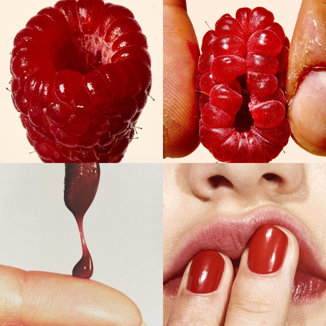
8/ Raspberry
I’ve had the chance to play with a lot of berry shades in my clients’ branding recently, and I’m loving it. Deep reds, burgundies, rich raspberry tones – they’re seemingly becoming more popular, and for good reason. They feel romantic, mature, and quietly bold without being overpowering. But this exact shade is everything: juicy, glossy, slightly sensual. It sits perfectly between beauty and food, softness and impact. I’ll never get bored of it.
9/ Swans
Swans are endlessly chic to me. Elegant, symbolic, and timeless. They add romance without feeling obvious or overdone.

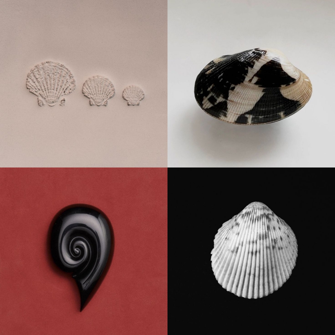
10/ Shells
Shells feel delicate but structured, which I love. The natural patterns and textures are so beautiful, and they instantly bring in references to nature: water, sand, the sea. There’s also something very feminine about them. Fertility, rebirth, softness. They add meaning without trying too hard.
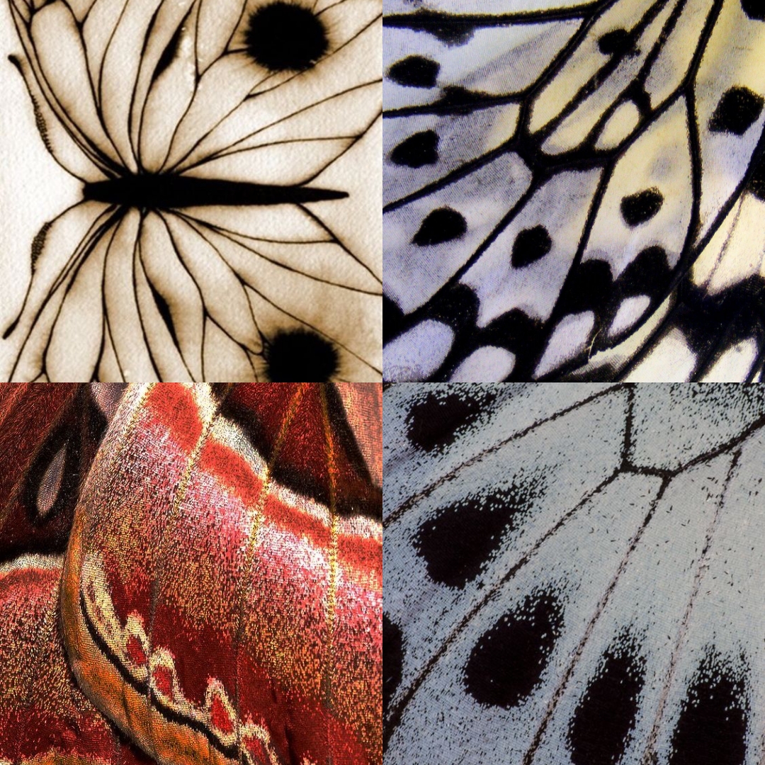
11/ Butterfly Prints
The pattern of a butterfly wing genuinely makes me stop and appreciate God’s creation. The structure, the symmetry, the way the veins connect and hold everything together. Zooming in on those details creates something so intricate and beautiful. It’s endlessly inspiring.
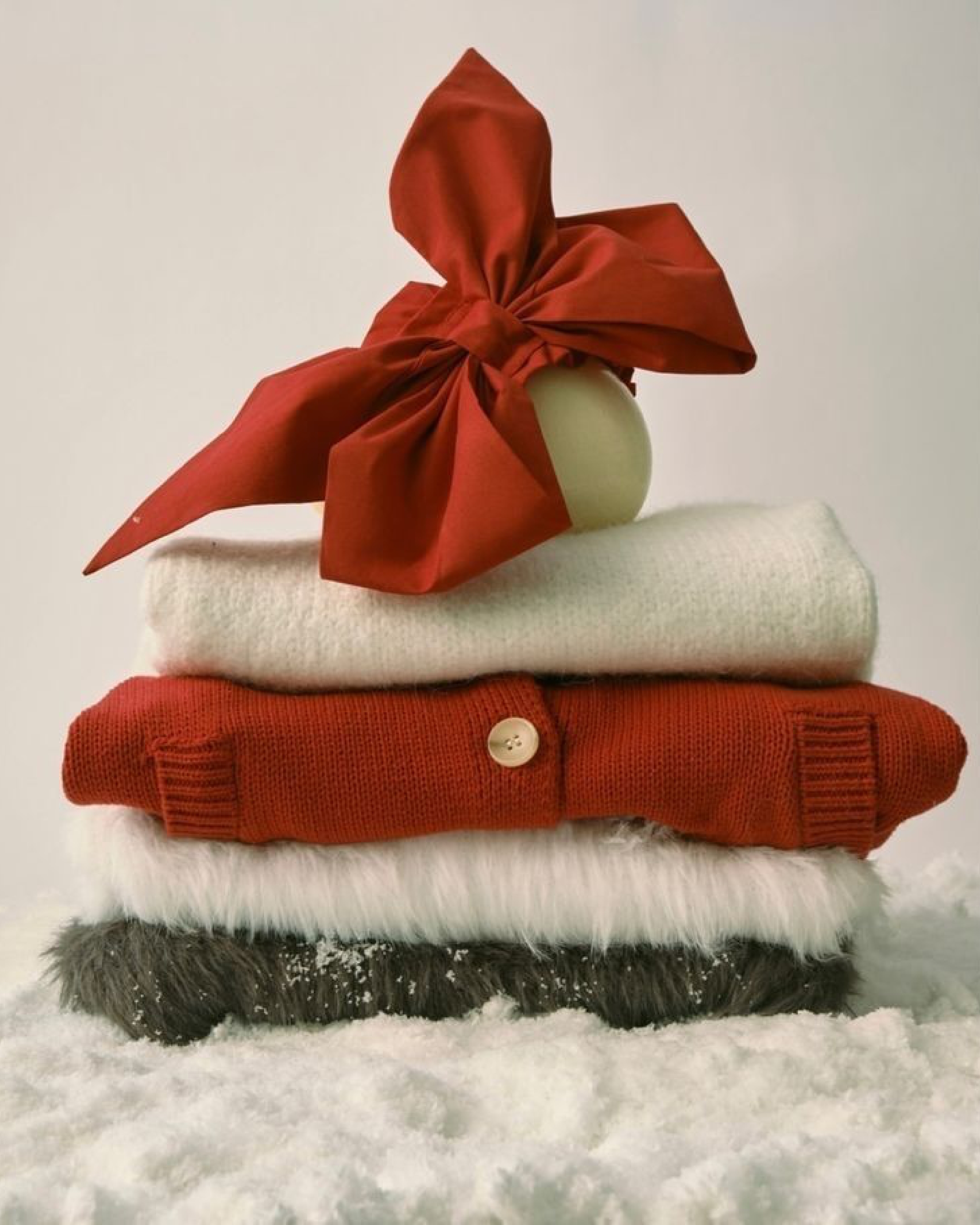
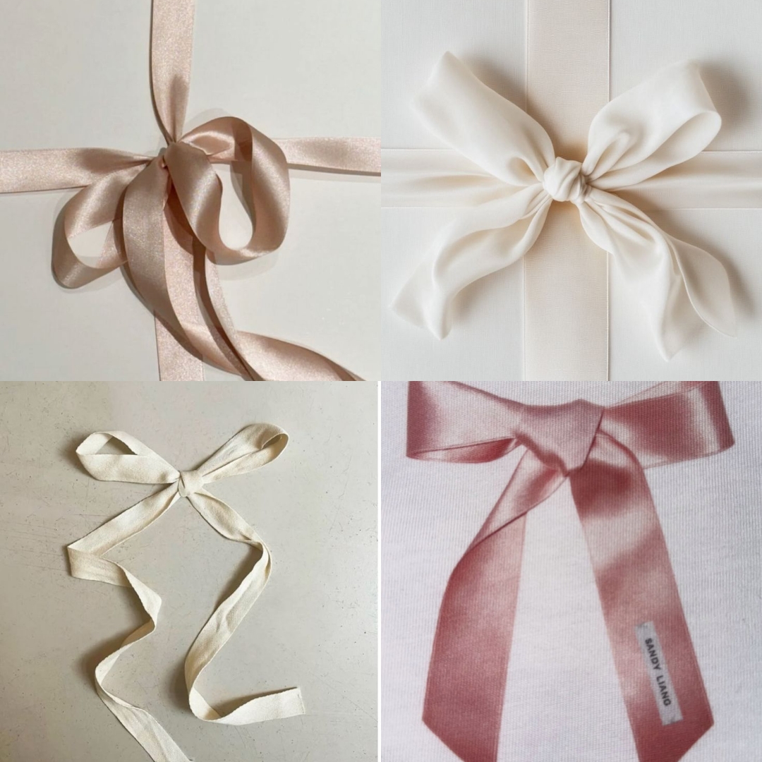
12/ Pastel Ribbons
Soft bows, satin finishes, sheer ribbons. They add ceremony and sweetness without tipping into anything too cutesy.
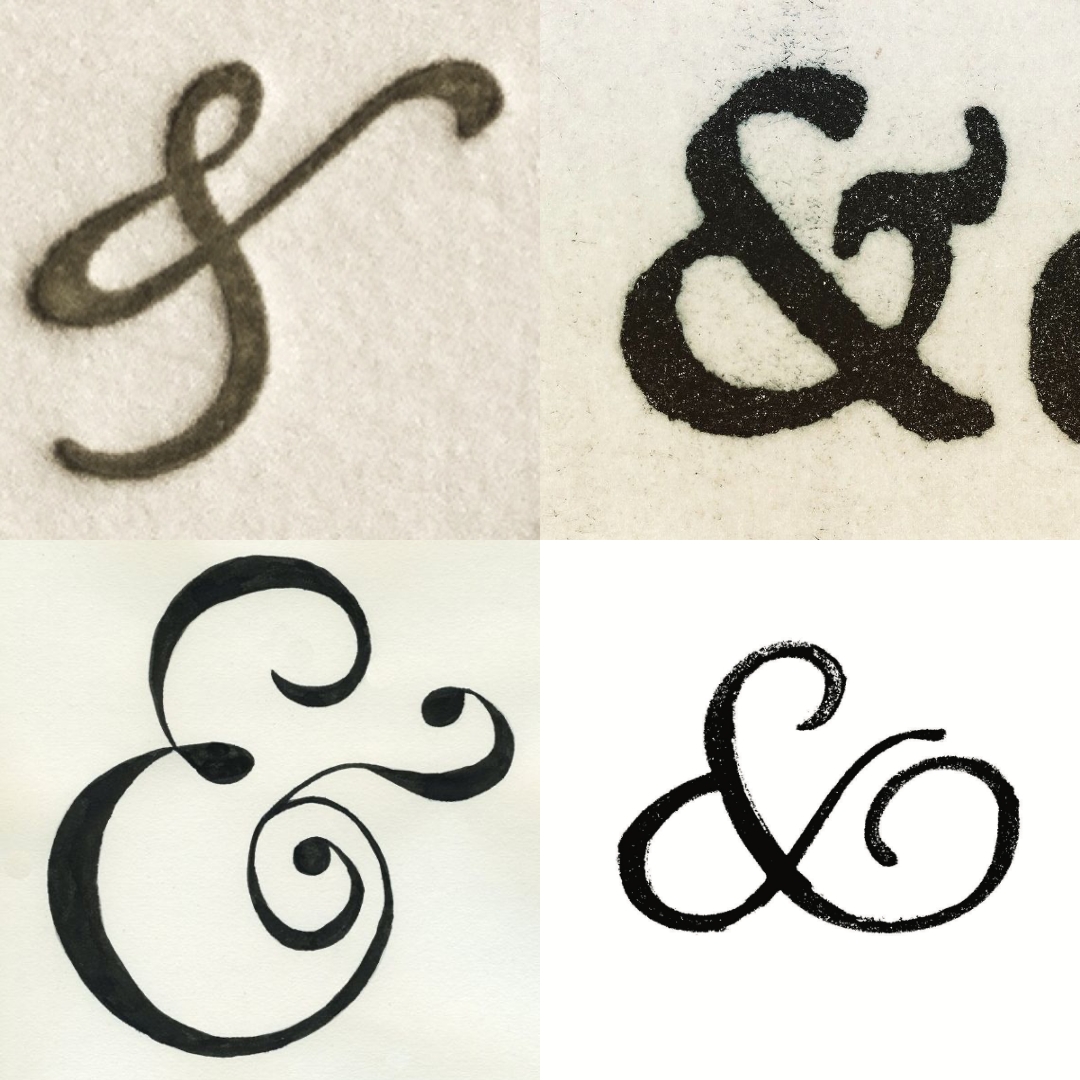
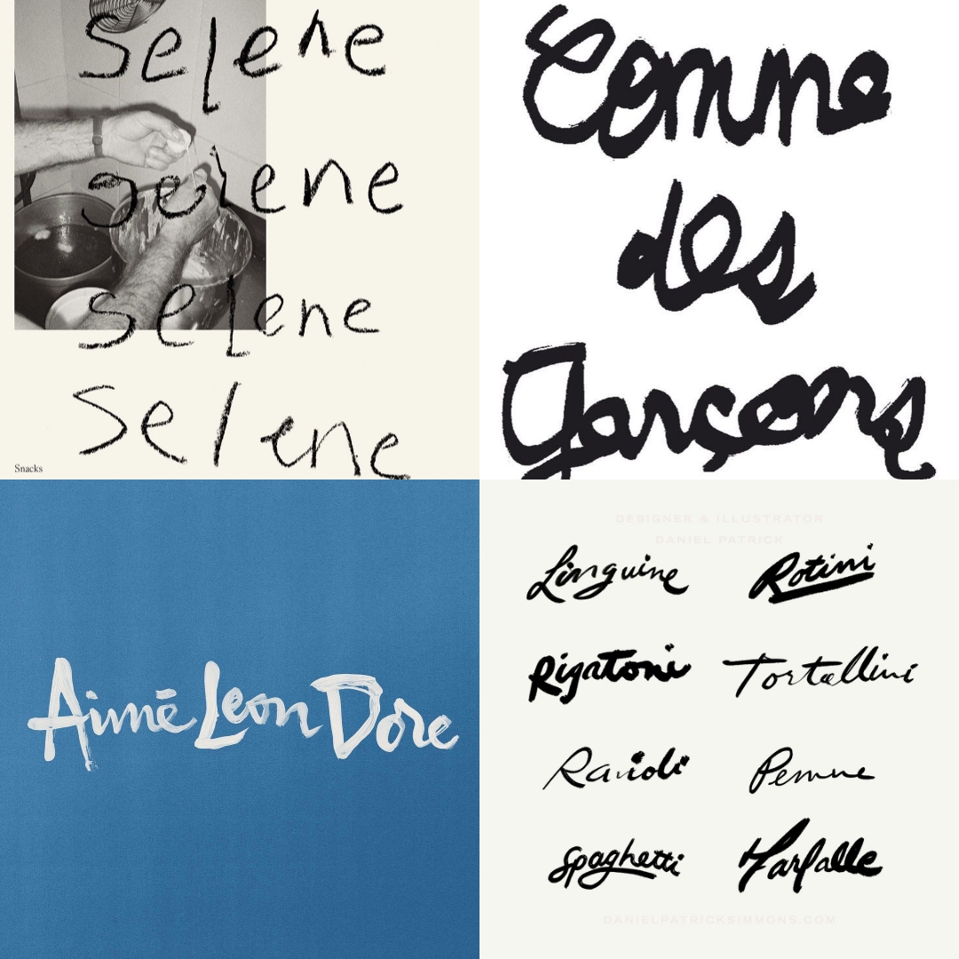
13/ Styled Ampersands
A good ampersand will always get my attention. Curved, expressive, slightly imperfect, it’s such a small detail, but it adds so much personality.
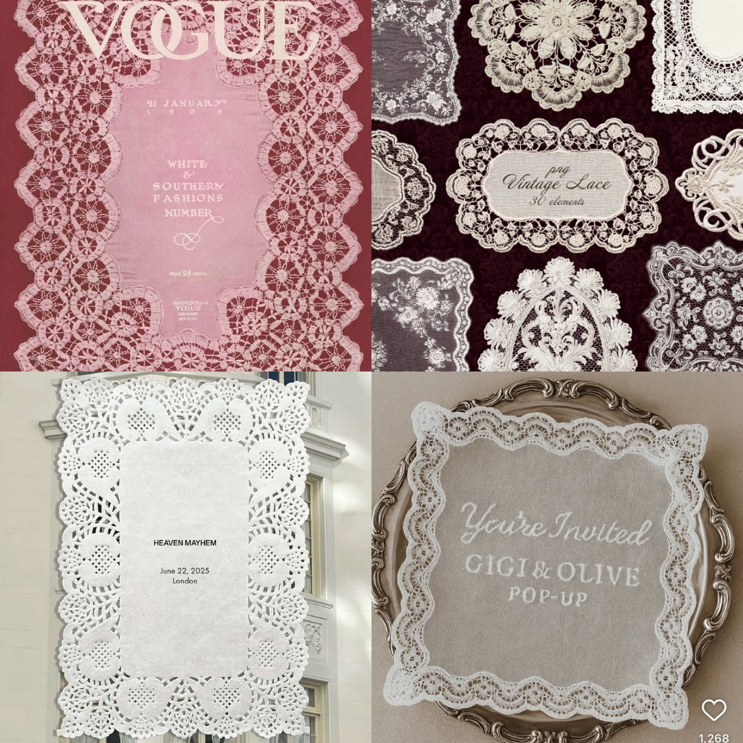
14/ Text on Lace
Typography layered over lace feels intimate and unexpected. I love when branding borrows from hospitality, fashion and heritage like this.
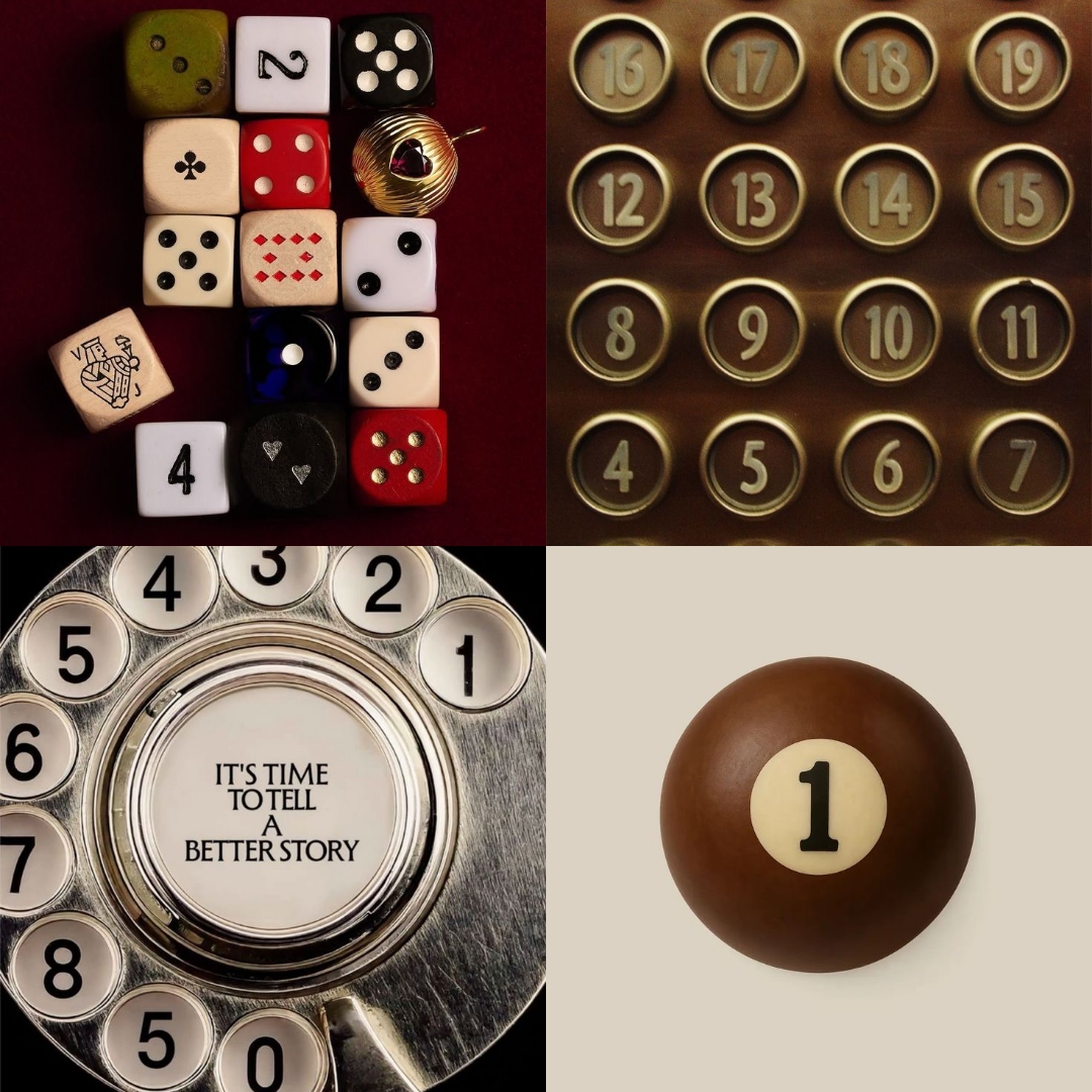
15/ Numbers (Especially in Circles)
I don’t know what it is, but the satisfaction of a sequence of numbers set perfectly inside circles is chef’s kiss. You find these moments everywhere: old elevators, telephones, control panels. They’re so simple, so functional, and yet somehow incredibly beautiful.
16/ Bare-Faced Shoots
I love branding that lets skin be skin. Minimal makeup, natural texture, real presence. It feels confident and honest.
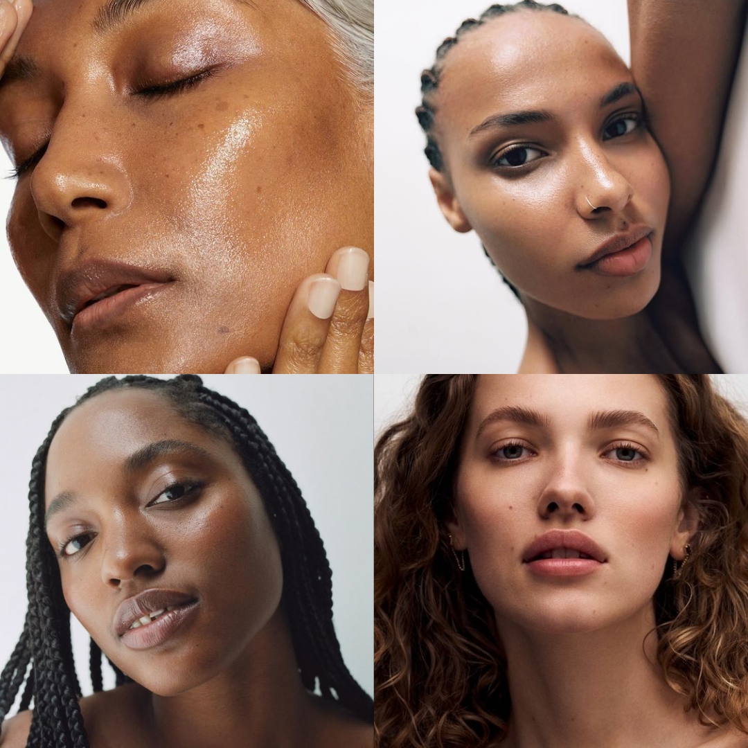
17/ Older Women in Campaigns
This is something I want to see more of. Age brings depth and authority, and it instantly makes a brand feel more interesting and considered.

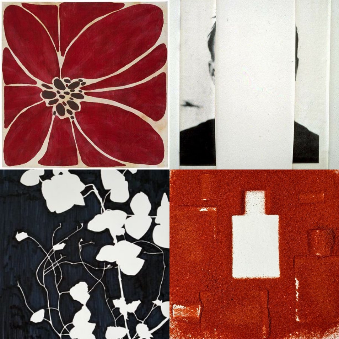
18/ Negative Space
Space is a design choice. I love branding that isn’t afraid to leave things untouched. It always feels more confident and editorial.
19/ Crayon & Brushstroke Typography
Imperfect, hand-drawn lettering that feels expressive and warm. It adds movement and personality in a way polished type sometimes can’t.
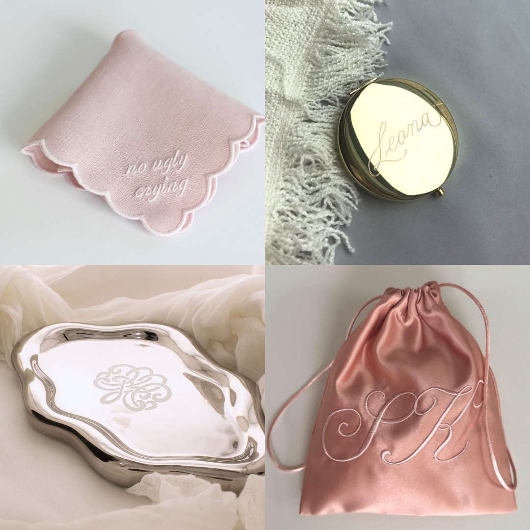
20/ Calligraphy Embroidery & Engraving
Calligraphy that’s stitched, pressed, or engraved feels so romantic. It turns typography into something tactile and lasting.
21/ Tassels on Stationery
Tassels make everything feel ceremonial. It’s such a small detail, but it instantly makes paper feel like an object worth keeping.

22/ Burnt, Earthy Colour Palettes
These palettes feel like a step away from what everyone usually goes for – either ultra-minimal neutrals or bold, bright colours. Burnt oranges, rusts, olives, oil-paint shades don’t feel like an in-between. They feel grounded, rich, and truly timeless.

23/ Branded Desserts
Specifically tiramisu. The dessert itself is already chic – the coffee, the whipped mascarpone, the softness, but also the darkness and maturity of the coffee. It’s elegant and timeless. So when brands apply their identity to it, it feels cool and immersive in the best way.


.svg)


.svg)
.svg)