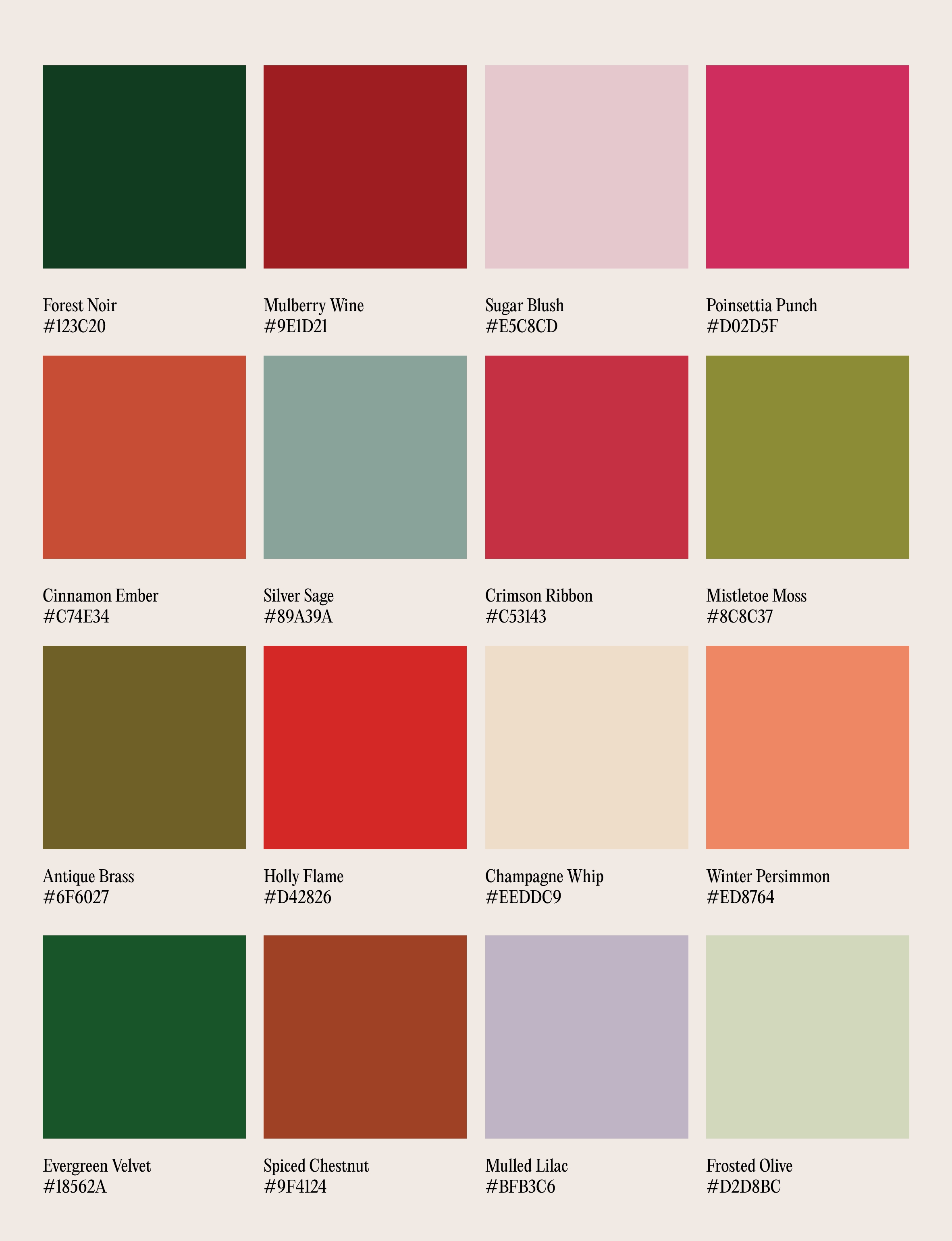
Every December, the same story plays out: metallics, jewel tones, red and green, done again. But this year feels different. The mood has shifted – softer, slower, more grown up. Designers and brands alike are embracing colour that feels less performative, more atmospheric.
Last year, we explored chic reds to replace the classic red; this edit continues that evolution. The new festive mood isn’t about nostalgia, it’s about nuance. Colours that feel lived-in, quietly luxurious, and entirely modern. Because true festivity isn’t in the spectacle, it’s in the mood it leaves behind.
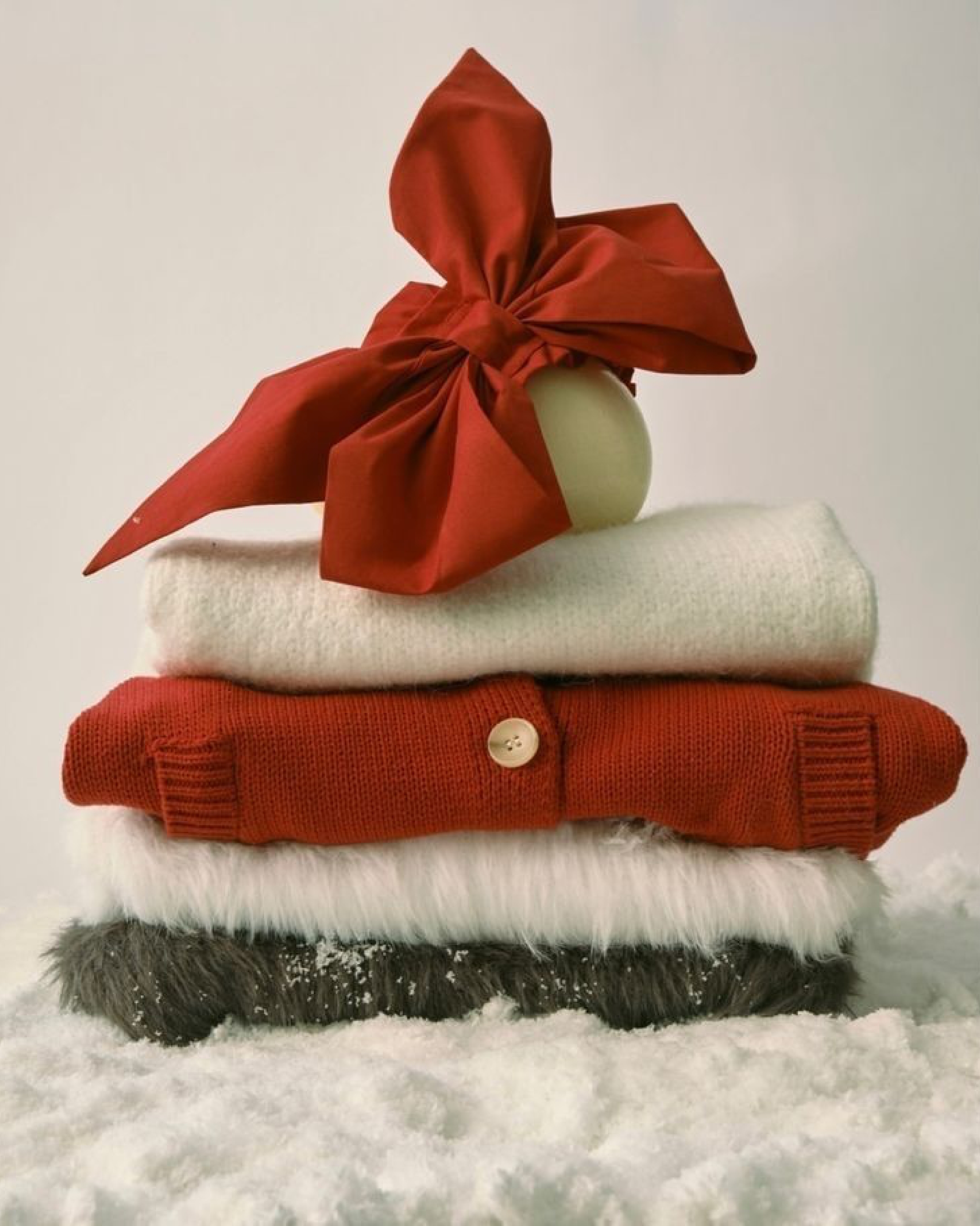
Forget red and green as you know them. This season’s palette leans deeper, softer, more unexpected. The kind of tones that look as good in a brand campaign as they do on a candle-lit table. Think Forest Noir and Evergreen Velvet as your grounding base: rich, polished, confident. Then add the slow burn of Holly Flame and Crimson Ribbon, warmth that glows rather than shouts.
There’s space for softness too. Sugar Blush, Mulled Lilac, and Poinsettia Punch give the palette its subtle lift – a modern take on romance that pairs well with texture and tone. And to keep everything from tipping into the traditional? Silver Sage and Frosted Olive, quietly balancing the warmth, with Champagne Whip adding just enough light to feel celebratory, not excessive.
The result: a palette that feels festive without the fuss. Refined, dimensional, and a little unexpected – perfect for brands and creatives ready to approach the season with mood, not noise.


.svg)


.svg)
.svg)