TikTok’s #girlhood hashtag has attracted over 1.3 billion views, with viral spinoffs like #girl maths, #girl dinner, the strawberry girl beauty look and snail‑girl lifestyle. It’s a pivot away from the slick girl‑boss feminism of the 2010s; commentators see today’s hyper‑girly motifs – bows, Mary Jane shoes, Peter Pan collars and chiffon layers – as a playful pushback against relentless negativity and the fatigue of perpetual hustle. Even high‑end designers like Simone Rocha and Miu Miu and mass retailers like H&M have drenched their collections in bows and hearts. 2023 was dubbed the “year of the girl,” forecasting that 2024 will see maximalist “bow stacking” – ribbons piled upon ribbons in beauty and fashion.
Now, in 2025, this obsession isn’t confined to fashion runways; it’s infiltrating everything from brand tone of voice to the way we shop. Beauty packaging looks like it belongs on a Pinterest mood board, brand social media feeds read like group‑chat memes, and even canned drinks arrive in pastel pantone palettes. At the heart of it all is a longing for the innocence and safety associated with girlhood. Why does this resonate so deeply right now, and how are brands leveraging it?
What exactly is “girlhood” branding?
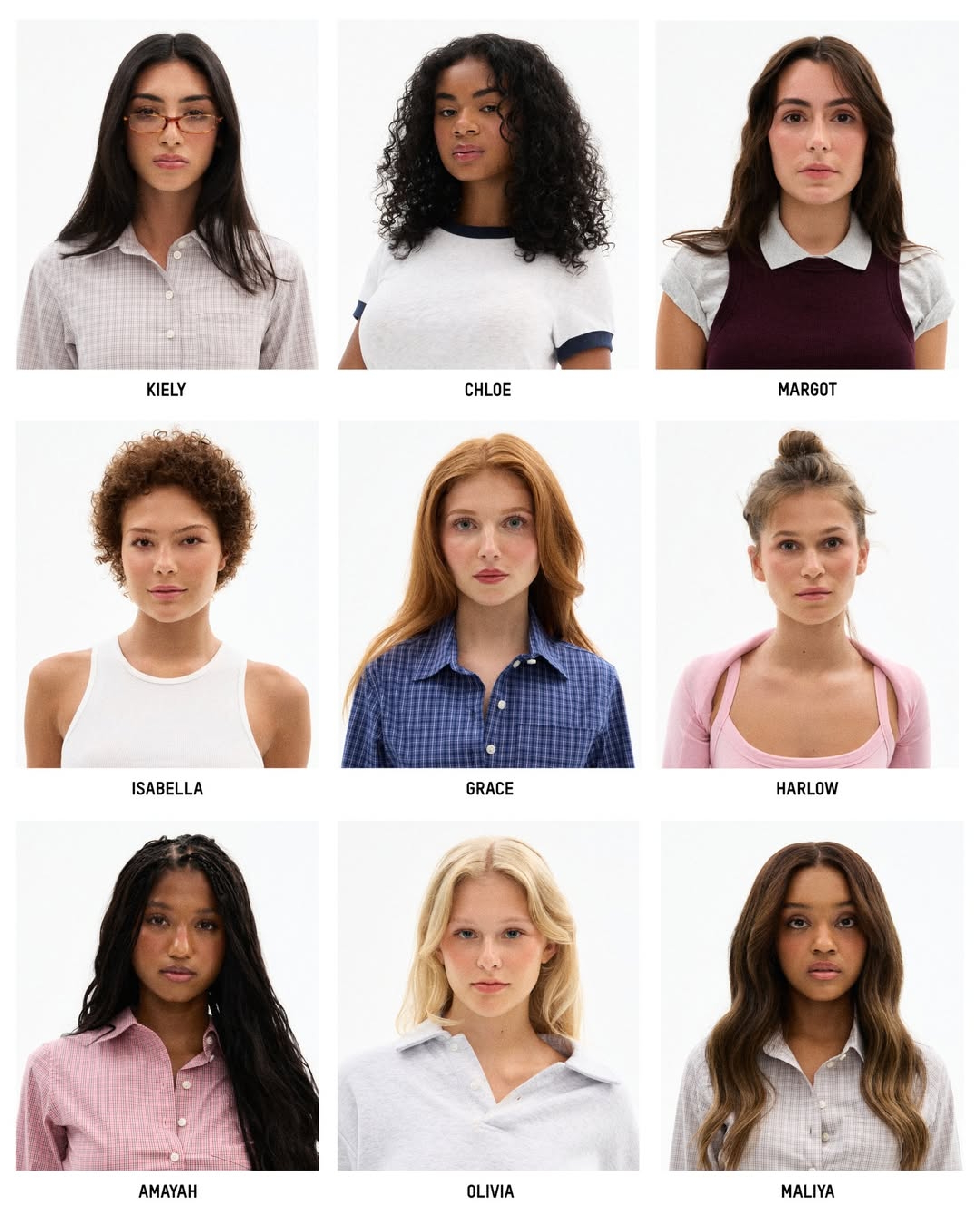
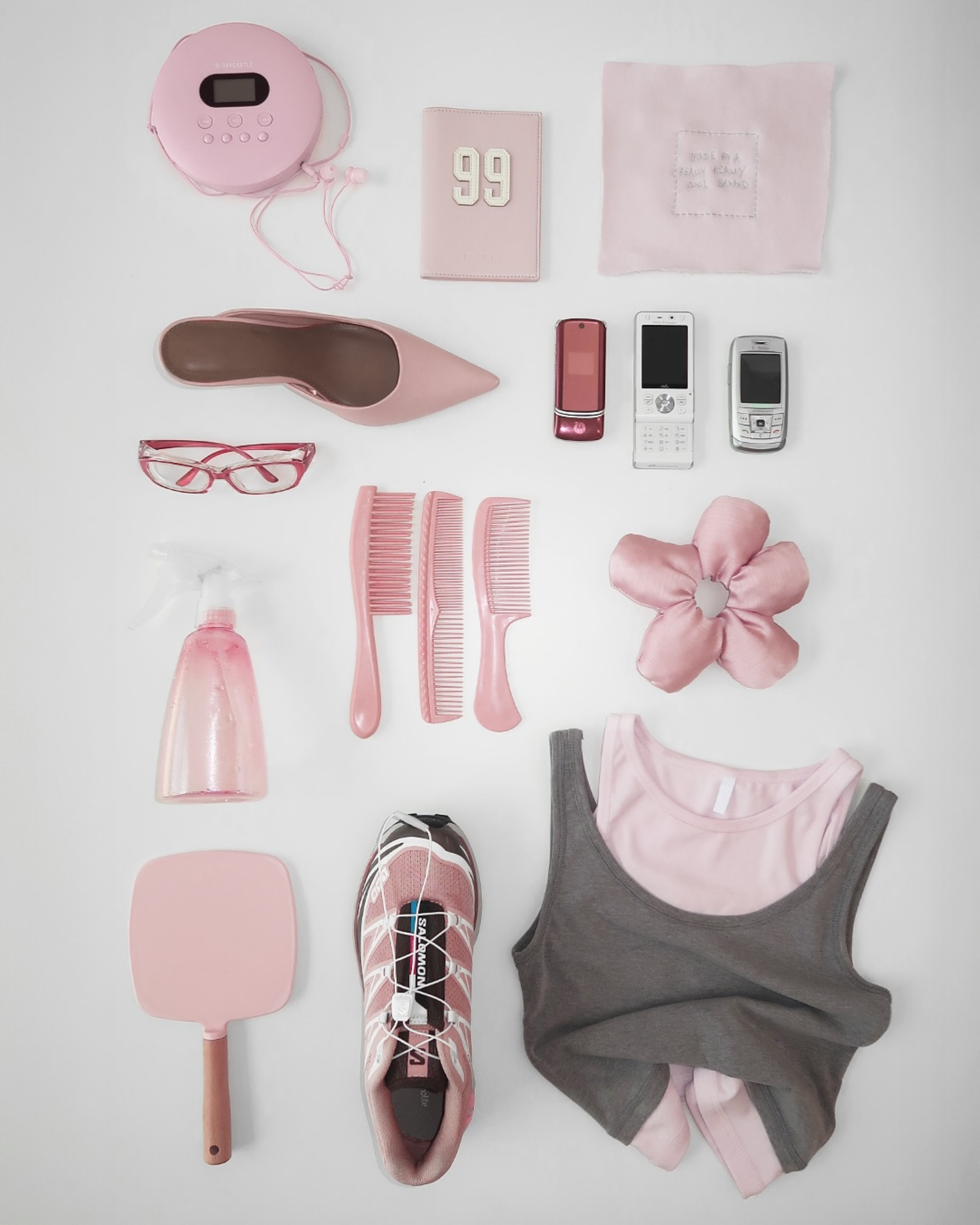
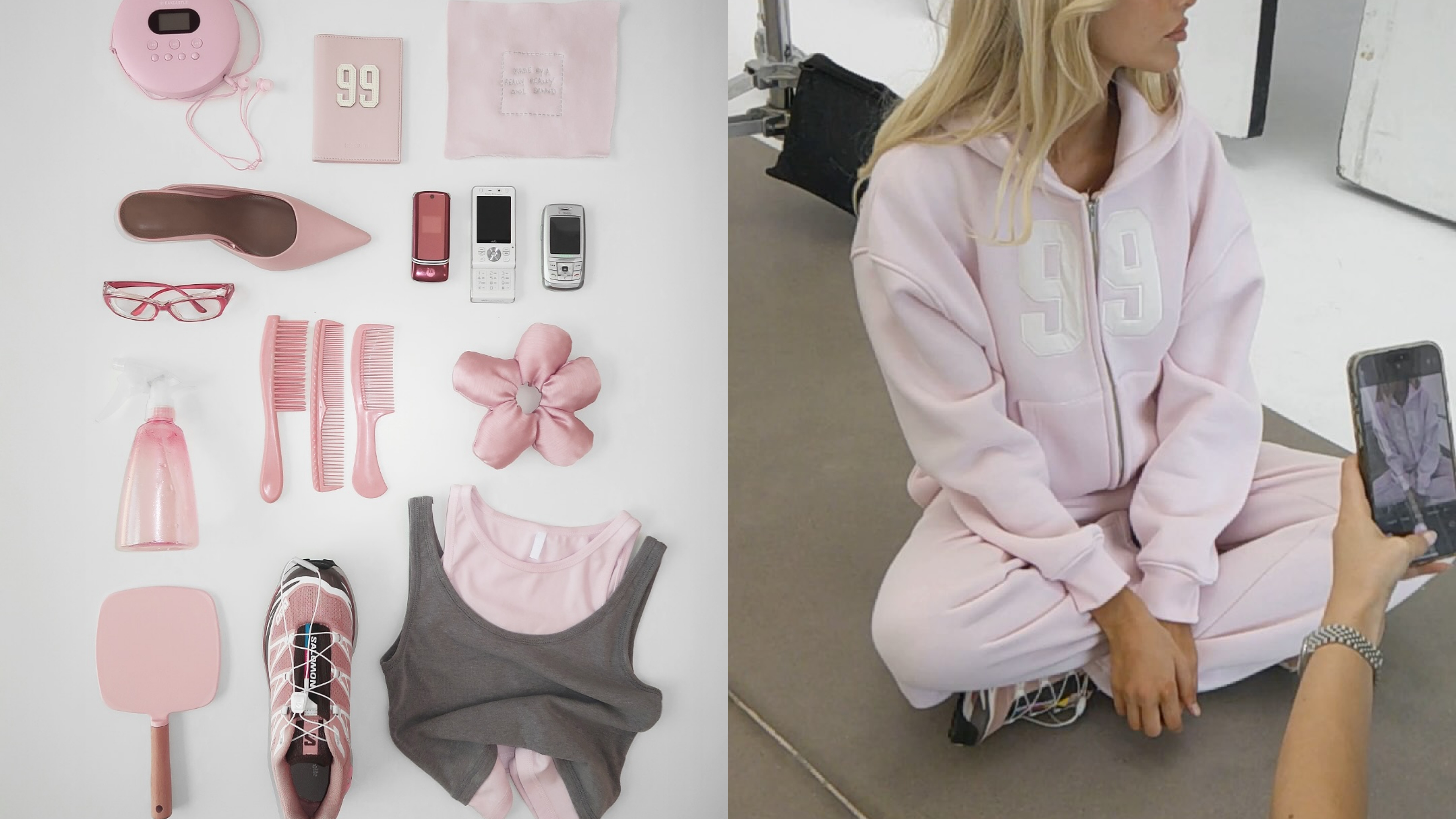
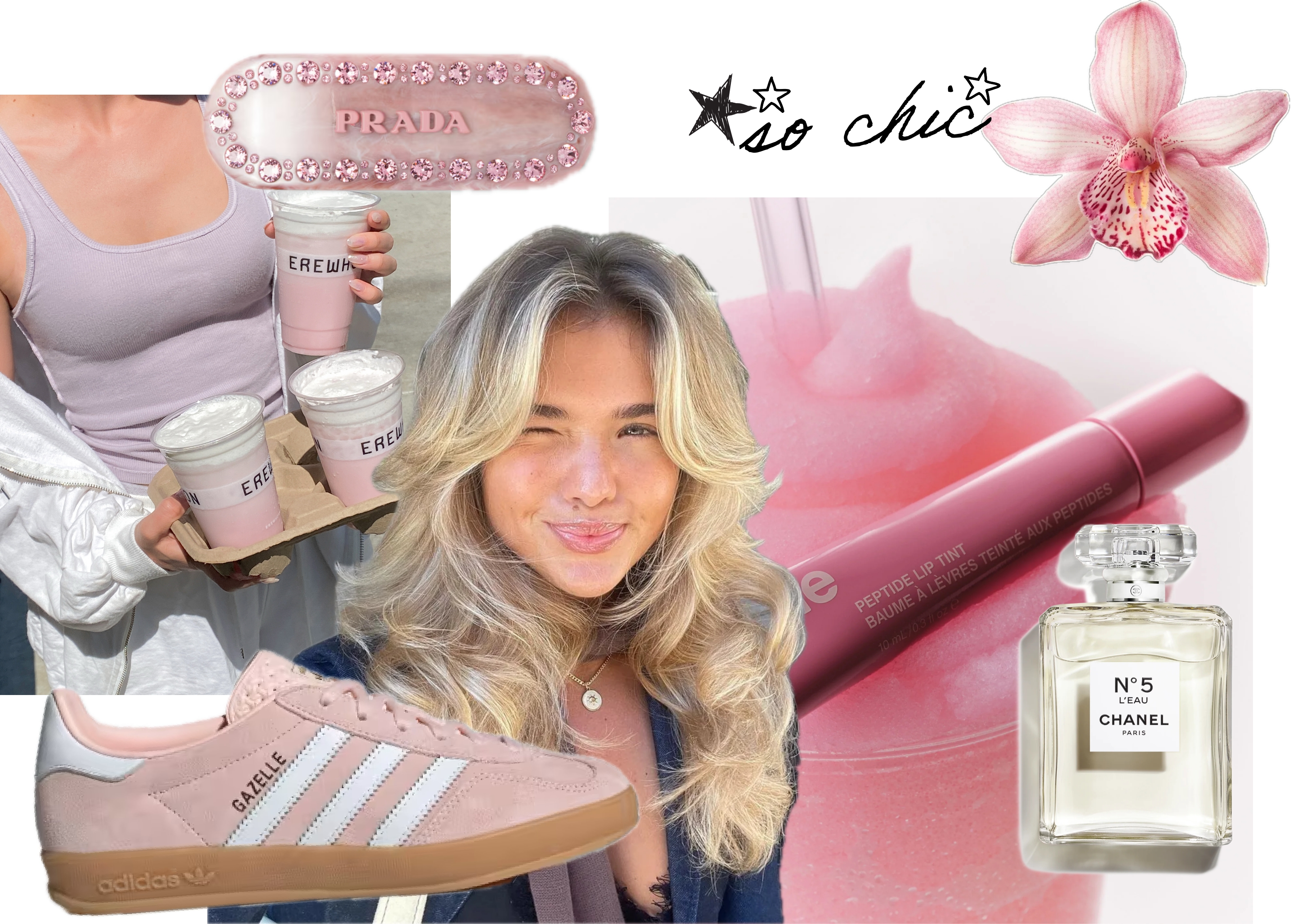
Girlhood branding isn’t about age but about evoking a feeling – a sense of softness, safety and nostalgia. It draws on signifiers of girlish innocence: ribbons, lace, bows, lip gloss, hearts and plush textures. The look sits somewhere between coquette and cottagecore: pastel colour palettes, delicate serif fonts and dreamy visuals designed to feel like a sleepover scrapbook. Reports note brands targeting Gen Z are “embracing a soft, nostalgic aesthetic with pastel pinks, delicate fonts and dreamy visuals,” stating that 68 % of Gen Z consumers engage more with brands using these styles and that pastel colours increase shelf appeal among U.S. Gen Z shoppers by 22 %. In other words, the softness isn’t a throwaway trend – it’s rooted in demonstrable consumer behaviour.
Visual cues are only half of it. Girlhood branding is also about tone. Copy leans into internet slang and affectionate humour; product names read like text messages from your best friend. Even customer‑service emails sign off with hearts or a “✨.” As we’ll see, the emotional cues behind these decisions are just as important as the aesthetics.
Emotional and visual drivers: nostalgia and safety
For Gen Z, nostalgia isn’t about re‑living their own childhood – many never experienced the 1990s, yet they still crave the comfort of a pre‑digital era. In a world shaped by climate anxiety, pandemic scars and economic uncertainty, nostalgia offers something rare: stability. And because most purchasing decisions are driven by emotion, brands that channel feelings of safety, belonging and joy – the kind you’d find at a teenage sleepover – see deeper engagement.
It’s why hyper‑feminine packaging is thriving. Brands like Summer Fridays, Glow Recipe and Rhode design products that are clean, colourful and perfectly primed for the “social media shelfie.” Packaging has become its own love language: unboxing your moisturiser now feels like unwrapping a personal love letter.
Gen Z and the innocence revival
The return of girlhood reflects a cultural shift among Gen Z towards seeing softness as power. What was once dismissed as frivolous – bows, blush, coquette hair accessories – is now worn with intent. It’s a quiet protest against the burnout‑era girlboss, an antidote to the constant churn of bad news. In this reclaiming of hyper‑femininity, vulnerability isn’t weakness; it’s agency, control and self‑definition.
Brand examples: tapping into collective memory
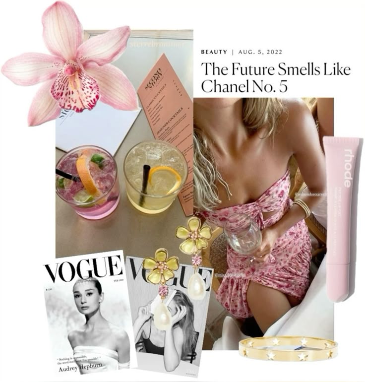
Rhode – emotional minimalism
Hailey Bieber’s Rhode has become a standout among celebrity beauty lines, generating more than $70 million in 2023 revenue and growing 300 % year‑over‑year. Its success hinges on what Hustle magazine calls emotional minimalism. Rather than flooding shelves with SKUs, Rhode offers a tightly edited assortment of barrier‑building skincare. The packaging’s muted tones – soft greys, creams and pastels – evoke calm and control, giving consumers permission to simplify their routines. The brand foregrounds ingredient transparency and community building, emphasising trust over celebrity hype.
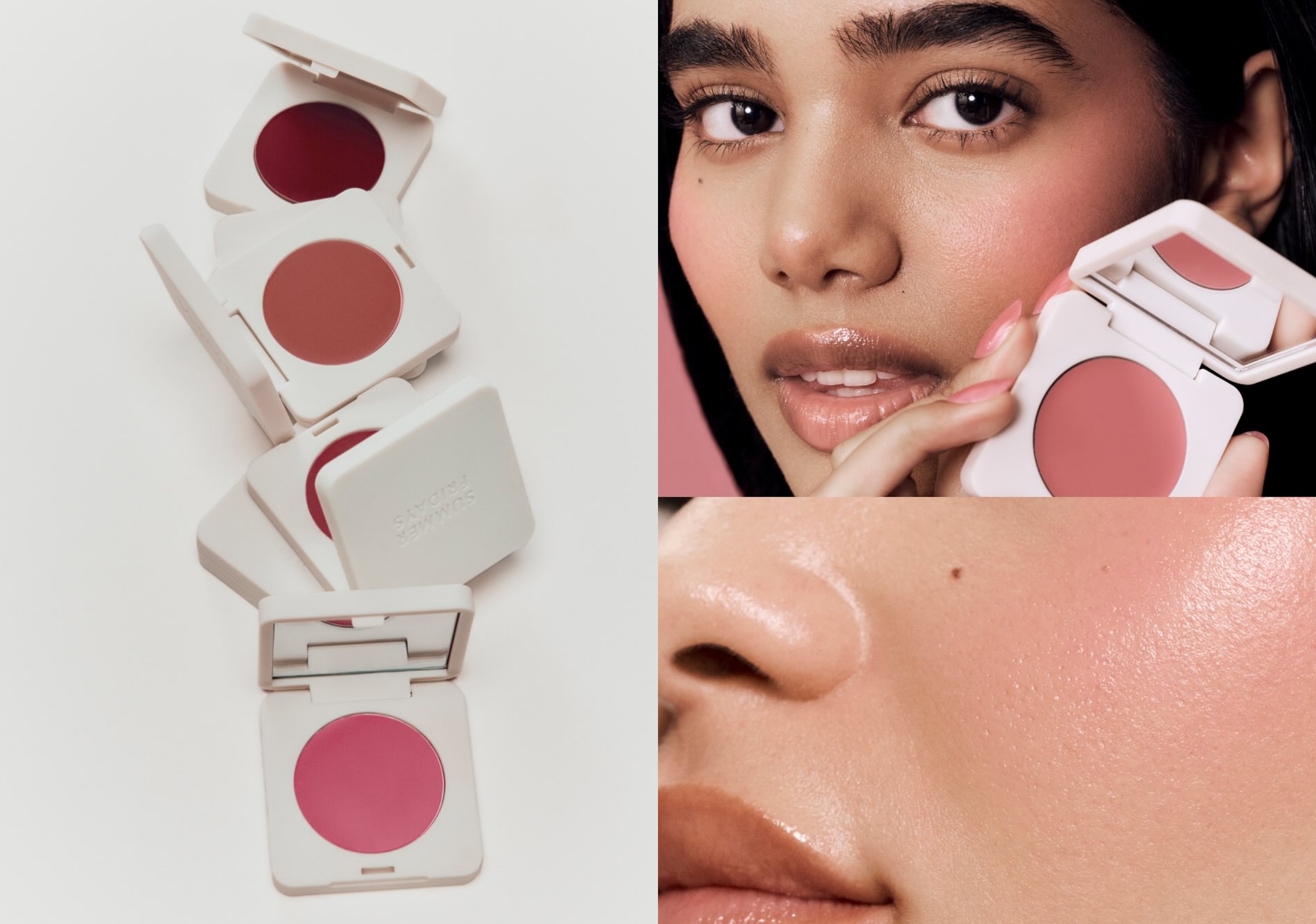
Summer Fridays –pastel escapism
Launched with the Jet Lag Mask in 2018, Summer Fridays quickly captured a devoted following. ROE Magazine credits its success to a clean, versatile formula, minimalist pastel packaging and a community‑centric approach. The brand’s Sweet Shoppe pop‑up saw lines wrap around the block as fans queued for limited‑edition pastels and nostalgic treats, illustrating how Summer Fridays turns shopping into a sensory experience. Simplicity and influencer marketing keep the brand aspirational yet accessible. Summer Fridays shows that the soft girl aesthetic can be subtle and wellness‑oriented rather than saccharine.
Crown Affair – quiet luxury and ritual
Crown Affair is the quiet luxury of haircare – polished, pared‑back, and purposeful. Its vegan formulas come in frosted glass bottles and minimalist black‑and‑white packaging, with tortoise‑shell combs that seem to whisper from the vanity. Rather than flooding the market with endless SKUs, the brand offers a single, refined version of each essential, powered by ingredients like yuzu extract and tsubaki seed oil. The result is haircare as ritual: calm, intentional, and quietly covetable.
LoveShackFancy – maximalist girlhood
LoveShackFancy lives in a world of pink, bows, lace, tulle and flowers – founder Rebecca Hessel Cohen’s self‑declared house codes. Think tea parties, tiered cakes and a Marie Antoinette fantasy, designed as an aspirational escape from the seriousness of adulthood. The brand’s “more is more” ethos attracts everyone from teens to their mothers, though even its Fall 2024 collection tempered the sugar rush with black and leather.
Bonbonwhims – Y2K candy
Jewelry label Bonbonwhims, founded by AAPI designer Clare Ngai, taps into Y2K nostalgia with enamel, resin and freshwater pearls. The brand describes itself as “nostalgia and good vibes inspired” and notes that it is known for its Y2K‑aesthetic designs and playful use of mixed materials. Signature pieces like the Ling Bling and Rainbow Lucky Initial Rings became viral best‑sellers and attracted celebrity fans such as Taylor Swift, Gigi Hadid and Ariana Grande. In other words, Bonbonwhims fuses the collectible charm of childhood friendship bracelets with the grown‑up world of demi‑fine jewelry.
Sisters and Seekers – cool‑girl twist on girlhood
Not every brand leaning into girlhood is draped in pastel ribbons. Sisters and Seekers, founded by sisters Alice and Maisie Jones in 2017, has built a cult following with a minimalist yet edgy aesthetic that feels more “cool girl” than coquette. The Welsh fashion label grew from a garden‑shed start‑up into an $18.9 million business by blending streetwear sensibilities with a sense of sisterhood. Rather than marketing fantasy, the brand invites fans into its reality: employees feature in TikTok and Instagram posts that show day‑in‑the‑life vlogs, humorous office skits and outfit‑of‑the‑day tour. This raw, behind‑the‑scenes content humanises the company and builds a sense of community and loyalty among followers. In other words, Sisters and Seekers taps into girlhood by celebrating friendship and authenticity – a cool‑girl counterpoint to the hyper‑feminine aesthetic.
The strategic advantage: emotional immersion
Brands embracing girlhood are doing more than chasing a trend – they’re creating emotionally immersive worlds that deliver community and belonging. Psychology tells us that most purchasing happens below the level of rational thought. When packaging, messaging and community events collectively evoke safety and joy, consumers feel seen.
In the TikTok era, packaging is as much about performance on camera as product performance itself – which is why Rhode’s grey tubes and Miu Miu's ballerinas dominate FYP feeds. Nostalgia also has staying power: whether it’s printing photos, buying Y2K‑inspired rings or treating haircare as ritual, Gen Z seeks tangible connections. From Bonbonwhims’ friendship‑bracelet‑style jewellery to curated “earscapes” at Studs, even the smallest purchase becomes part of a bigger, more sentimental story.
Risks and critiques
While the girlhood aesthetic is undeniably powerful, it risks veering into infantilisation or exclusion. LoveShackFancy’s Fall 2024 collection drew criticism for mixing baby‑pink corsets with adult‑leaning pieces, leaving reviewers wondering whether it catered to teens or adults. Hyper‑girly branding can also inadvertently reinforce narrow definitions of femininity, alienating consumers who don’t identify with pastel aesthetics. There’s a fine line between tapping into nostalgia and pink‑washing; as with any trend, authenticity matters. Brands need to ensure that their messaging isn’t trivialising adult experiences or glossing over diversity within womanhood.
- Gender and inclusivity – Despite its empowering intentions, the “soft girl” aesthetic is built on culturally coded markers of femininity – bows, blush, pearls – that may exclude non‑binary or gender‑nonconforming consumers. By positioning softness as the only acceptable form of vulnerability, brands risk reinforcing stereotypes about what femininity should look like. There’s also the question of who gets to participate in girlhood: in a society where Black and brown girls are often denied innocence, a commodified nostalgic aesthetic can feel out of step if it doesn’t grapple with intersectionality. Thoughtful brands are broadening their palettes, casting diverse models and using humour or irony to keep the aesthetic from feeling prescriptive.
- Environmental sustainability – One blind spot in the girlhood boom is packaging waste. Pastel tubes and ornate boxes may make for dreamy unboxings, but they add to the mountain of single‑use materials. Gen Z is paying attention: more than half say they’re less likely to repurchase if packaging isn’t sustainable, and most want designs they can recycle or reuse. For brands, the future of girlhood marketing will mean balancing aesthetic delight with circular design. Crown Affair’s recyclable glass bottles and long‑lasting ritual tools offer one blueprint; others could explore refills or biodegradable materials. In an era of climate anxiety, a blush‑pink tube will have to prove it’s worth the environmental cost.
Why this moment matters
The surge of brands leaning into girlhood nostalgia reveals a broader cultural desire for softness and emotional connection. After years of hustle‑culture messaging, Gen Z and young millennials crave safety, playfulness and community.
Softness is no longer synonymous with weakness; it’s a powerful branding tool that communicates care, transparency and belonging. For businesses, the lesson is clear: design for the heart as well as the eye – and don’t ignore the mind. The most resonant brands today are those that invite consumers into a nostalgic, safe space without pigeonholing femininity or compromising on sustainability. A ribboned bow or pastel tube can be a portal back to simpler times, but it should also be recyclable and inclusive. Girlhood, it turns out, is serious business – and serious responsibility.


.svg)


.svg)
.svg)